| Image |
Comment |
| 01/30/2005 10:39:16 AM |
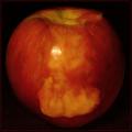
Apple Coreby charliebakerComment: I gave this a low score because it's blurry it lacks appeal for me, particularly related to the challenge. I do notice that the centering and the color are good, though. |
 Photographer found comment helpful. Photographer found comment helpful. |
| 01/30/2005 10:35:00 AM |
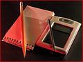
The State of the Artby The_ItinerantComment: This is a great idea that fits the challenge wonderfully. Times sure have changed! The pen could use a little more sharpness, but the Word screen couldn't be better. |
| Photographer found comment helpful. |
| 01/30/2005 10:32:37 AM |
Downsizedby HOOlovesdrumsComment: Looks like effort was put into getting the pencil / pen angles just right. A little USM and a little less red tone would've been nice, but this is a nice composition anyway. 6 |
| Photographer found comment helpful. |
| 01/30/2005 10:30:54 AM |
1874 ~ 2004by glad2badadComment: This has beautiful colors and sharpness (except maybe on the green jigger). Something's missing (maybe the "wow" factor?) for me though - I'm sorry I can't be more constructive - I'm really trying. 6 |
| Photographer found comment helpful. |
| 01/30/2005 10:28:15 AM |
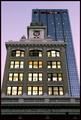
Linear Generationsby banmornComment: The detail of the older building seems much better than that of the newer. The super-tight crop emphasises the wonderful angles / lines you've chosen. Just wish the new building were as sharp as the old one. 8 |
| Photographer found comment helpful. |
| 01/30/2005 10:25:42 AM |
|
| Photographer found comment helpful. |
| 01/30/2005 10:24:39 AM |
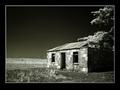
The Winds of Timeby devboboComment: Really beautiful post-processing. I'd love to know how you did this. What you've done with the light is amazing. The only tiny thing negative I can say is that the frame is too thick for me. This is a good shot to show off with a very thin frame or none at all. The windmills in the background complete this shot. |
| Photographer found comment helpful. |
| 01/30/2005 03:33:53 AM |
|
| Photographer found comment helpful. |
| 01/30/2005 03:32:10 AM |
Happy 3 DPC!by KaDiComment: I like the movement of the gold party thingie up in the left corner. The candles could be a wee bit sharper. The shot is nicely arranged. |
| Photographer found comment helpful. |
| 01/30/2005 03:28:53 AM |
Happy 3 DPC!by mrorange002Comment: This may sound odd, but the only thing that detracts from this image for me is that the lips dominate the photo more than the candles. Maybe if the woman were slightly more in the background or even just a bit lower in the frame (the candles could probably have even stood alone here). The use of black space, the focus, and the colors are all excellent. |
| Photographer found comment helpful. |
Home -
Challenges -
Community -
League -
Photos -
Cameras -
Lenses -
Learn -
Help -
Terms of Use -
Privacy -
Top ^
DPChallenge, and website content and design, Copyright © 2001-2025 Challenging Technologies, LLC.
All digital photo copyrights belong to the photographers and may not be used without permission.
Current Server Time: 04/11/2025 11:57:17 PM EDT.