| Image |
Comment |
| 12/14/2005 12:38:01 AM |
|
 Photographer found comment helpful. Photographer found comment helpful. |
| 12/14/2005 12:36:19 AM |
Almost Fiveby LaMerryComment: better without border - also, I'm not a huge fan of the subject matter... just not pretty imo |
| Photographer found comment helpful. |
| 12/14/2005 12:33:39 AM |
Asleepby nico_blueComment: I like it, but would have been better if you could have gotten rid of the shadows |
| Photographer found comment helpful. |
| 12/14/2005 12:32:02 AM |
|
| Photographer found comment helpful. |
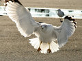
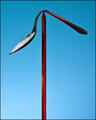
| 12/12/2005 10:30:49 PM |
Landingby alienhelixComment: Hi. IMO the background is okay as is, but I do see your point about it being distracting. My suggestion would be to tone down the brightness of the background to make the white bird pop out more. I'm not great with photoshop, so there may be a better way to do it, but I would select the bird and either burn the background or decrease the contrast of the background. |
| Photographer found comment helpful. |
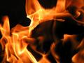
| 12/12/2005 10:22:24 PM |
Needle and the Damage Doneby soupComment: Hey, I didn't vote in this challenge so I'm coming to leave you a message now. By the way, it also irritates me when a picture of mine does worse than I expected and no one leaves me comments. COMMENTS, PEOPLE.
I had never heard the lyrics quoted in the title before today and when I saw the shot my first impression was that the white was a mistake and that the "damage done" referred to the bending of the spoon. In other words, I bet a lot of people didn't even get the reference. It wasn't until I read in your description that it was a song lyric that I realized the white represented heroin (and, of course, we don't get the description when voting).
Even if I had understood the reference, while I like the symbolism of the white powder, I feel that it detracts from the beauty of the image. For me it ruins the pretty contrast of the red against the blue. Without the white the picture is composed only of two bright primary colors (blue/red). The white muddles that starkness, imo.
If I had voted on the contest and had not understood the reference of your title, I would have given you a 5. If I had understood I would have given you a 7. |
| Photographer found comment helpful. |
| 10/24/2005 12:49:56 AM |
Flamesby shepherdtrainerComment: Pretty - I especially like the spiral you can see in the top branch of flame |
| Photographer found comment helpful. |
| 10/24/2005 12:47:45 AM |
|
| Photographer found comment helpful. |
| 10/24/2005 12:47:01 AM |
|
| Photographer found comment helpful. |
| 10/24/2005 12:45:07 AM |
very fine taxiby tomzinhoComment: lol, this is one of my favorite photos in terms of subject matter! A few things I think would have improved it a little, though: 1. desaturate the red a little 2. try not to blow the highlights (e.g. by using lower ISO, smaller aperture, or using exposure compensation), 3. watch reflections which gave you the weird green thing in the middle of the shot (maybe by using a different angle). maybe a different crop in which taxi plays a more prominent role. |
| Photographer found comment helpful. |
Home -
Challenges -
Community -
League -
Photos -
Cameras -
Lenses -
Learn -
Help -
Terms of Use -
Privacy -
Top ^
DPChallenge, and website content and design, Copyright © 2001-2025 Challenging Technologies, LLC.
All digital photo copyrights belong to the photographers and may not be used without permission.
Current Server Time: 04/18/2025 02:35:46 PM EDT.