| Image |
Comment |
| 11/24/2008 03:00:58 AM |
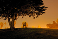
One of Life's Many Benchmarks.by twotkynsComment: Among the overly-contrasty and false color images here, this one does stand out. I love the concept and composition. The contrast and colors work to enhance an otherworldly appearance to this image. |
 Photographer found comment helpful. Photographer found comment helpful. |
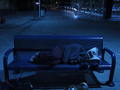
| 11/24/2008 02:57:29 AM |
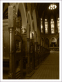
They sat, He listenedby peterComment: The low perspective creates a sense of inferiority in the viewer. This may be intentional here, but the tilted perspective and the abrupt crop/framing create a disturbing image. My own bias certainly comes into play here, but the overall darkness alongside the afore mentioned elements does create an ominous mood. |
| Photographer found comment helpful. |
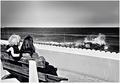
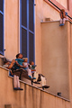
| 11/24/2008 02:51:57 AM |
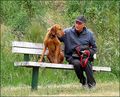
Rest Stop.by jomariComment: A touching candid. Could probably be cropped in a bit. |
| Photographer found comment helpful. |
| 11/24/2008 02:36:03 AM |
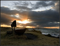
A windy dayby JohannesFrankComment: Very nice, the high contrast actually works here! Beautiful landscape and nice timing. |
| Photographer found comment helpful. |
| 11/24/2008 02:33:30 AM |
Waitin' For The Trainby GeneralEComment: I'm not really sure if there was a particular message you were going for, but this does come off as a bit exploitative and opportunistic. If there is a message other than "hey, look what i found", I don't see it. Sorry. |
| Photographer found comment helpful. |
| 11/24/2008 02:30:31 AM |
father's dayby JuliBocComment: Great timing, the contrast certainly adds drama. OTOH, the contrast is a bit harsh. I rarely advocate for soft focus and vignettes, but a tender moment might work better with that style. OTOOH, a rebellion against convention adds an edge to an otherwise somewhat cliche shot. As you can probably see, I'm a bit conflicted here. |
| Photographer found comment helpful. |
| 11/24/2008 02:16:04 AM |
Wavesby lkn4truthComment: I love the colors and pattrn here, but the overall image appears a bit flat. Pulling up the black point slider in a levels adjustment may add a bit more contrast or "pop". |
| Photographer found comment helpful. |
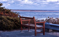
| 11/24/2008 02:13:46 AM |
late fall for a benchby whiterookComment: Can't tell if the lake/ocean is frozen or if it's just contrast pushed in post. Still, it does convey a mood of stillness or even lonliness. I'd like to see the framing pushed a bit to the right. Centered compositions often generate a clinical appearance that tends to detract from the mood of the image. |
| Photographer found comment helpful. |
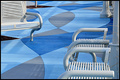
| 11/24/2008 02:09:04 AM |
Pumpkin Soupby BarbBComment: Ok. High contrast. Visually interesting, but the question remains... why? What does this say? I'm afraid I'm confused. |
| Photographer found comment helpful. |
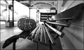
| 11/24/2008 02:07:23 AM |
window doll benchby ytshuvaComment: Technically exellent! The compositon really works, but I have to admit that I find these shots really creepy. |
| Photographer found comment helpful. |
Home -
Challenges -
Community -
League -
Photos -
Cameras -
Lenses -
Learn -
Help -
Terms of Use -
Privacy -
Top ^
DPChallenge, and website content and design, Copyright © 2001-2025 Challenging Technologies, LLC.
All digital photo copyrights belong to the photographers and may not be used without permission.
Current Server Time: 04/12/2025 07:29:02 PM EDT.