| Image |
Comment |
| 02/10/2004 11:40:32 PM |
|
 Photographer found comment helpful. Photographer found comment helpful. |
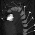
| 02/08/2004 04:01:30 PM |
Changing A Bulb In The Darkby lear202btComment: Greetings from the Critique Club
By Inspzil
Composition - Pretty well composed I think actually. Not terribly exciting, but not dull by any means. It could use something a little brighter and more eyecatching methinks. The only thing that I see here that I would change with this composition is the framing. I don't see any advantage to having all the dead space to the right. If you were going to have negative space in this photo, none of it would be on the right or above the lamp. The shade should be on the top right so that it opens up to the "room" which here is just the frame. The flame might be just a pinch bright, but I think it can stay where it is at that intensity and nothing is seriously hurt.
Technical - Whoever's hands these are should be a surgeon. This is a mighty clear photo for being a 1 sec exposure. Good capture in that sense. I'm not sure the painting with light technique is used here totally, at least I'm not getting that from what I see. But what I do see is that you did a great job taking this photo whatever the technique.
Overall - Not bad. Better than my first photo for sure. I think I'd have done a different crop. You might a different crop and see if I'm full of it or if there is some semblance of truth in that. At any rate, not a bad first shot and good luck with your future shots. Any question, feel free to PM me. - Bob |
| Photographer found comment helpful. |
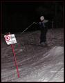
| 02/08/2004 03:51:14 PM |
Rules Are There To Brokenby MonaComment: Greetings from the Critique Club
By Inspzil
I'll keep this short and to the point. I'm a little confused that this picture is in this challenge.
Composition - The subject is not grabbing me right away. The sign is a major distraction as it is easily the brightest thing on the page. The challenge is painting with light, which to me would indicate a shutter speed much much slower than 1/30 sec. The light seems to be diffuse and I don't see what exactly was painted with light.
Technical - This picture isn't terribly clear. It isn't lit very well, and it looks grainy probably from the ISO 320. I don't think the technique of the challenge was used at all and if it was, I can't see how.
Overall - Looks to me like your photo was entered in the wrong challenge or you clearly did not understand what the challenge was on this one. I know this sounds like a harsh critique, but quite frankly, I'm a little lost on this one. Sorry this is not helpful at all. I'm not sure what the right thing to say IS. How about Best of luck in future challenges. - Bob |
| Photographer found comment helpful. |
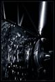
| 02/08/2004 02:54:12 PM |
Sunset At The River Of Hammer And Steelby MundiComment: Conceptually very good. I'd have like to seen the light source a little more idffused to make it larger and not quite as bright. That would've allowed more exposure time and a little better exposure of the tools. I think the set up is good. The focus is just a little soft, but not too bad. Good creative photo. |
| Photographer found comment helpful. |
| 02/08/2004 12:04:26 PM |
hammer_strobeby SeanachaiComment: I like this photo. I was going to do one similar to it actually. I love doing strobe shots. Its hard to get them to come out just right. This one is good except for one tiny little detail... why is the subject swinging the hammer for a claw-side impact? As a photo though, its very good. 8 |
| Photographer found comment helpful. |
| 02/08/2004 12:02:41 PM |
::RED HOT::by DsealeComment: If this were just focused I bet it would do a whole lot better. I think it was well conceived and pretty well set up too, just isn't quite the quality that it needs to be. |
| Photographer found comment helpful. |
| 02/08/2004 12:01:36 PM |
|
| Photographer found comment helpful. |
| 02/08/2004 10:20:41 AM |
Floating Artby RoosterComment: One of the most orignal of the entries this challenge. nice work 8
|
| Photographer found comment helpful. |
| 02/08/2004 10:09:40 AM |
Sawsby paynekjComment: I'm not sure what purpose cutting both of these off serves. Nice toning to the pictures and I believe the subjects are pretty good. why cut them off? and both of them to boot. |
| Photographer found comment helpful. |
| 02/08/2004 10:08:28 AM |
Climbing Mountains Highby KonadorComment: this is just a little bit underexposed for my tastes. A little bit brighter would've done you good here I think. This is a nice composition and a well taken photo, just a pinch dark.7 |
| Photographer found comment helpful. |
Home -
Challenges -
Community -
League -
Photos -
Cameras -
Lenses -
Learn -
Help -
Terms of Use -
Privacy -
Top ^
DPChallenge, and website content and design, Copyright © 2001-2025 Challenging Technologies, LLC.
All digital photo copyrights belong to the photographers and may not be used without permission.
Current Server Time: 04/18/2025 04:32:14 AM EDT.