| Image |
Comment |
| 01/25/2004 12:07:47 AM |
The Spearmanby flip89Comment: Greetings from the Critique Club
By Inspzil
Composition - This is a really nice composition as it is. The only thing I can see here is that its tight in the frame. There seems to be a little bit of the pole showing behind it but its not a huge distraction.
Technical - To me, this seems to be where all the problems fall. The sky has some funky things going on that look like the results from oversaturating. It could also be some noise from the longer exposure. It seems like the exposure might have been just a little too long. Shortening that would've cut down the hot spots and maybe even a little of the background noise. I'm still trying to figure out what the blue line is right above the base of the statue.
Overall - I'm disappointed that this didn't do better than it did, even with some of its shortcomings. I thought it was a better photo than 5.0 but I guess I'm just one voter. Take care, good luck and all that stuff - Bob |
 Photographer found comment helpful. Photographer found comment helpful. |
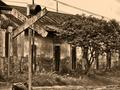
| 01/24/2004 05:59:15 PM |
Sign of Oldby RgarciaComment: Great toning. The color of this sign is really authentic like an old photo. Great shot. I think this one should do pretty well 8 |
| Photographer found comment helpful. |
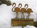
| 01/24/2004 05:56:40 PM |
Not In This Weather They Don't!by basia03Comment: some funky effects on the heads and necks of the flamingos. There may be some oversharpening or compression issues involved. The title sure says a lot too. |
| Photographer found comment helpful. |
| 01/24/2004 05:55:17 PM |
|
| Photographer found comment helpful. |
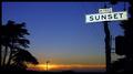
| 01/24/2004 04:09:19 PM |
Sunsetby faidoiComment: This is pretty good. The colors were pretty good. Something went wrong though. It's breaking up a bit at the top probably due to saturation. MIght be a little oversaturated. Its a nice shot still. 7 |
| Photographer found comment helpful. |
| 01/24/2004 04:07:35 PM |
|
| Photographer found comment helpful. |
| 01/24/2004 03:33:05 PM |
sign in the skyby darcyComment: way too much saturation. The color in the sky is cool, but its breaking apart from oversaturation. |
| Photographer found comment helpful. |
| 01/24/2004 03:31:29 PM |
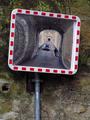
WATCH OUT -- BLIND SPOTby RUEDISCHMUTZComment: This is an interesting picture. I don't know if that qualifies it as a sign, but its better than most of the other pictures in this challenge. 7 |
| Photographer found comment helpful. |
| 01/24/2004 03:30:10 PM |
A very scenic driveby leskatausComment: One of the better ones I've seen. Good colors. The shadows are just a little heavy. I like the color saturation, but I think a little more exposure would've done you well for this shot. Good work 8 |
| Photographer found comment helpful. |
| 01/24/2004 03:28:41 PM |
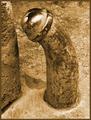
Left Turn(ed)by GPComment: This looks a bit phallic to me. What the hell does it have to do with roadsigns? I guess I get a chuckle out of it. It does seem a bit strange to me though. Maybe I'm the only one skewed enough to see it that way. Or maybe not.... |
| Photographer found comment helpful. |
Home -
Challenges -
Community -
League -
Photos -
Cameras -
Lenses -
Learn -
Help -
Terms of Use -
Privacy -
Top ^
DPChallenge, and website content and design, Copyright © 2001-2025 Challenging Technologies, LLC.
All digital photo copyrights belong to the photographers and may not be used without permission.
Current Server Time: 04/21/2025 10:43:12 PM EDT.