| Image |
Comment |
| 10/11/2005 10:08:22 PM |
A well deserved celebrationby bob_bobskiComment: This photo certainly tells a story. I like that you included the timer showing his finish time and the onlooker who is happy for this fellow. Looks like it was a personal triumph. I'm thinking the dof might be better if the photo was either all in focus or the background a lot more out of focus. The CW tilt is a little bothersome, but not terribly so. Exposure is very good and his expression is priceless~ :-) |
 Photographer found comment helpful. Photographer found comment helpful. |
| 10/11/2005 10:03:47 PM |
School Holidays, YEEHAHby owenComment: For some reason, I get the feeling this is a merge of two different photos, but I reserve the right to be wrong! ;-) The expression on the girl certainly tells of joy and the celebration of youth and vitality and, um, nature (?). If it's a comp, it's fairly well done. I'm guessing if it's not a comp, it looks a little "unnatural" because of the use of a fill in flash, perhaps? Anyhow, it's a fun subject and an enjoyable photo~ :) |
| Photographer found comment helpful. |
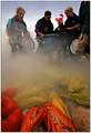
| 10/11/2005 09:58:42 PM |
Clambake!by Bear_MusicComment: The low wide angle viewpoint works esp. well here, but the dark edges (from editing?) around the people's heads is a bit strange looking. Comp could be stronger (the person cut in half on the right is a bit bothersome) and the lack of happy expressions doesn't exactly shout out the theme of celebration, but all in all a good effort. Exposure is excellent for a tough lighting situation~ |
| Photographer found comment helpful. |
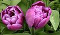
| 05/20/2003 02:47:33 AM |
Purpleby cykhansenComment: Lots to like about this shot...focus is great, composition is interesting, focus is spot on, exposure is great...but...the colors do look a bit like the water washed them out! I'd love to see more color saturation and a little less sharpening, but a very good effort overall. ~Renee |
| Photographer found comment helpful. |
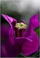
| 05/20/2003 02:43:22 AM |
Bunga Kertasby tkonxComment: No idea what the title means...this looks like some sort of bougainvillea, but it's an interesting viewpoint and the tiny water bubbles are very good. Background digital manipulation looks a bit overdone and sharp line of petal agains the background is a bit too sharply defined. Use of negative space is good, but the bottom of the image lacks some oomph due to it's being out of focus. Good effort...lots of potential here. ~Renee |
| Photographer found comment helpful. |
| 05/20/2003 02:36:35 AM |
Fluid painting by christoComment: Great stuff here...very creative and very well done. Looks like a digitally altered image, but still very cool! ~Renee |
| Photographer found comment helpful. |
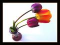
| 05/20/2003 02:29:47 AM |
Lean on Me by SonifoComment: I really enjoy the unusual perspective and creative use of color. The lighting and exposure and very good. Composition is nicely done as well, though a little tightly cropped around the top flower and at the bottome of the vase. Overall, a very successful image! Well done...~Renee |
| Photographer found comment helpful. |
| 09/24/2002 03:26:00 PM |
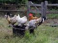
Mille fleuresby emorgan49Comment: So, are these French birds, lol? This certainly fits the theme...and your corner of the world is very different from most! Looks a bit out of focus (hand shake from too slow a shutter or too quick to snap perhaps?), but it's a lovely scene. The foreground could be cropped up a bit, but otherwise it's a fairly nice composition, and it's certainly an interesting subject. My French is very rusty, but doesn't the title translate to something like "A Thousand Flowers"? |
| Photographer found comment helpful. |
| 09/10/2002 06:04:00 PM |
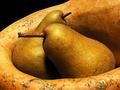
Boscs and Gourdby mcmurmaComment: I think we have a winner! This is just beautiful...the colors, composition, lighting, depth of field! Well done...a 10 in my book! |
| Photographer found comment helpful. |
| 09/10/2002 05:25:00 PM |
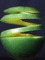
Twisted Granny Appleby alanfreedComment: I like the composition and idea behind this image. The focus is a tad soft in places and the crop is a wee bit tight there, but it's a good effort and developed further, could be a very outstanding image. I'd like to see a black or white background. I think the blue is not as effective as black or (high key) white would be. |
| Photographer found comment helpful. |
Home -
Challenges -
Community -
League -
Photos -
Cameras -
Lenses -
Learn -
Help -
Terms of Use -
Privacy -
Top ^
DPChallenge, and website content and design, Copyright © 2001-2025 Challenging Technologies, LLC.
All digital photo copyrights belong to the photographers and may not be used without permission.
Current Server Time: 03/12/2025 02:48:45 AM EDT.