| Image |
Comment |
| 07/23/2006 02:26:28 PM |
|
 Photographer found comment helpful. Photographer found comment helpful. |
| 07/23/2006 02:15:06 PM |
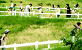
untitledby zxaarComment: This is original. An angle without the bush on the right might be nice. Highlights are also a bit harsh. nice job. 8 |
| Photographer found comment helpful. |
| 07/23/2006 02:06:35 PM |
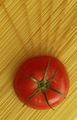
Pasta Kingby accadyComment: Because of its saturation, the tomato dominates the composition instead of lines. Nice idea. 7. |
| Photographer found comment helpful. |
| 07/23/2006 02:04:04 PM |
Darned Typos!by GeneralEComment: This is funny. I'll give it to you.8. Try to nail the sharpness better in the foreground. Perhaps a smaller aperture. I've made it a mission to try to master dof. Still working at it :) |
| Photographer found comment helpful. |
| 07/23/2006 02:00:49 PM |
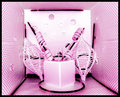
A Bunch of Linesby JeniYComment: Nice colors/tonal elements. Is the subject truly lines? To me, it reads more as interesting shapes and doesn't nail the challenge. Great eye and composition. 6. |
| Photographer found comment helpful. |
| 07/13/2006 12:49:21 PM |
...for 179 Yearsby LN13Comment: Here a few suggestions as per your forum post. Firstly, I really like richness, sharpness and tonal depth, the blacks are really dark without feeling like there is information lost.
Compositionally, it seems like you are going for rule of thirds by orienting the lighthouse on a third and having slightly more sky than water. In both cases, it feels like you are slightly more centered than on a third. These are only guidelines of course, but I may have tried to push the light house a bit to the right and add a little more sky in relation to the water. This seems impossible to do with a crop considering that the reflection of the trees would feel crowded if you cropped up from the bottom and the lights on the right would feel crammed as well if you cropped in. There is also something that happens on bad monitors when you have a gradient of rich blues (or any similar color.) I've noticed that the image can have these bands where the color jumps. I always like to test the image on a couple different screens because trolls with bad monitors will nail you for something like that. I've actually looked at all my top scoring photos and have noticed that they perform well on a variety of monitors. This sort of depresses me because I don't want photography to be about monitors and stupid stuff like that, but it may be what accounted for your 3 2s and 7 3s. Great shot, I'm looking forward to your future submissions. |
| Photographer found comment helpful. |
| 07/12/2006 01:23:45 PM |
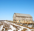
old barnby agenkinComment: I love the composition of this. My uncle is a landscape painter and this looks like a subject he would choose. Well done. |
| Photographer found comment helpful. |
| 07/12/2006 12:09:35 AM |
|
| Photographer found comment helpful. |
| 07/10/2006 02:00:54 AM |
Dessert in Bloomby LucidLotusComment: 5.5 is not bad. Great job technically. Probably some low scores because the cake draws a lot of attention, |
| Photographer found comment helpful. |
| 07/10/2006 01:22:42 AM |
The Garden ( In 3D )by SDWComment: 5.1 does seem very low for this nice shot. I would have expected to see this at about 5.9-6.2. Even though the depth of field is nice and soft, the gazebo is still the highest contrast element in the frame and draws the eye pretty hard. Good work! |
| Photographer found comment helpful. |
Home -
Challenges -
Community -
League -
Photos -
Cameras -
Lenses -
Learn -
Help -
Terms of Use -
Privacy -
Top ^
DPChallenge, and website content and design, Copyright © 2001-2025 Challenging Technologies, LLC.
All digital photo copyrights belong to the photographers and may not be used without permission.
Current Server Time: 04/25/2025 05:36:33 PM EDT.