| Image |
Comment |
| 11/02/2005 07:02:32 PM |
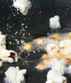
Busy Poppingby BigKComment: 7 - Good effort, good shot for the Challenge. Criticism; camera/lens dependent, more focus. Different crop may have also made this better in my opinion. Good idea. |
 Photographer found comment helpful. Photographer found comment helpful. |
| 11/02/2005 05:24:26 PM |
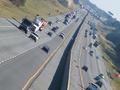
smog cityby melodeeComment: 7 - Well that's different. Undecided on the aspect/rotation. Like the idea though. The trucks add to a semi-vertigo type feeling. Criticism; slightly stronger colors perhaps, not sure. A different crop, especially to get the road/composition more 'balanced' may have made this better in my opinion. Good shot for the Challenge. Up to 7 from 6. |
| Photographer found comment helpful. |
| 11/02/2005 05:16:23 PM |
Find 3 Thimbles...by PrismComment: 7 - Like it, good idea, found them. Criticism; not much, like the composition, angle is good for this shot, maybe some more 'depth' here or there, a few highlight issues perhaps, but otherwise good 'different' fit for the Challenge. I think the frame suits this shot. |
| Photographer found comment helpful. |
| 11/02/2005 04:39:12 PM |
Buttonsby ElaineComment: 5 - Liked the concept. Technically, while no 'expert', seems to be you have done well to retain the 'surface' of the buttons (especially the white right rear ones) without 'blowing'. Criticism; I think that a sharper, or even 'direct on' angle, and a more bland background, may have made this better in my opinion. The marble (?) 'base' was perhaps not 'white enough' in my opinion when I voted for the Challenge, so either a greater depth achieved using this one (somehow) in order that you could have adjusted the color, or else using as I said, a blander (and whiter) 'base'. I agree with the comments made (and while perhaps 'rewording' required, also the 'more creative' one) and think that perhaps use of some 'space' somewhere may have helped this. The thing that I 'liked' most about this shot was the 'difficulty' you likely had 'technically' with those buttons for the Challenge. Perhaps a different crop too, again possibly the 'space' issue. |
| Photographer found comment helpful. |
| 11/02/2005 06:34:30 AM |
|
| Photographer found comment helpful. |
| 10/29/2005 11:10:30 PM |
Morning Dip circa 205A.Dby lytaComment: 8 - Nice. Good subtle colors. Good use of grain/noise(?) for the Challenge. Criticism; not much, perhaps a tighter crop at the top, or a slightly sharper (ground up-ish) angle, may have made this a better shot in my opinion. I imagine it would look good b/w or sepia too, but I like that you left it like this. Perhaps even more grain too, not sure. |
| Photographer found comment helpful. |
| 10/29/2005 10:49:05 PM |
|
| Photographer found comment helpful. |
| 10/27/2005 07:37:37 AM |
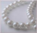
Remembranceby LucidLotusComment: 6 - Like the potential of this and the concept. Criticism; for what appears to be a macro (apologies if wrong) seems 'too close', or maybe it is just over blurred/softened. Definition/sharpness in at least a few 'pearls' at the fore would have made this much better in my opinion. I like the angle, and whilst I also like the 'composition'/centering, I wonder if some more 'space' left or fore, may have also made this better, not sure. As far as 'highlights' go, while no expert, seems you have done a good job to not blow any in this. |
| Photographer found comment helpful. |
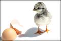
| 10/27/2005 07:21:41 AM |
... Chicken or the Egg? by banditComment: 5 - Do like this but - Criticism; main subject is too dark in my opinion to be able to effectively have the technical challenge of not blowing highlights. I would like to have seen the egg also in focus (especially for the Challenge and the highlight/technical issues, but this is a good shot as is), and be able to 'see' how well you did with not blowing the light color of the eggshell against the white background. |
| Photographer found comment helpful. |
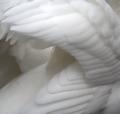
| 10/27/2005 07:18:37 AM |
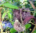
Cygnus Olorby TallblokeComment: 7 - Wow. Whilst no expert on 'highlight control' re the Challenge, seems to me you have done very well to not 'blow' any surface, save for a few feathers top middle. Criticism; difficult, as I do like this unusual view/angle, but (and especially for the Challenge) would like to have seen more of a 'white background' (even though I know the swan itself is basically 'the background'). Just, perhaps some more 'space' somewhere, giving more perspective/depth/not sure. Of course with 'basic' little could be done about the 'fly'(?) on the back. Good and very unusual shot. Up to 7 from 6. |
| Photographer found comment helpful. |
Home -
Challenges -
Community -
League -
Photos -
Cameras -
Lenses -
Learn -
Help -
Terms of Use -
Privacy -
Top ^
DPChallenge, and website content and design, Copyright © 2001-2025 Challenging Technologies, LLC.
All digital photo copyrights belong to the photographers and may not be used without permission.
Current Server Time: 04/23/2025 04:05:06 AM EDT.