|
|
|
Showing 3971 - 3980 of ~4217 |
| Image |
Comment |
| 08/01/2005 08:42:26 AM | ... And Through The Woods...by bruskiComment: '8' - This is a great shot - makes me want to hold onto the desk for stability. Criticism (with the caveat I know squat about long exposures); Difficult, but as I am sure you are aware, if there was perfect focus/sharpness on the handlebars at least, would make this 'pop out' even more than it does. Really that is about all I can say, other than perhaps a slight nudge rotation to the right, just a fraction. Must be a dink/tandem with the rider leant to the side(?), you did very well to get it centered. The colors are really great, love that green.. well done. |  Photographer found comment helpful. Photographer found comment helpful. |
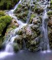
| 08/01/2005 08:39:59 AM | Nature's Melting Potby SJCarterComment: '7' - Nice shot. Criticism (with the caveat I know squat about long exposures); whilst I am a fan of this type of shot, I am wondering if perhaps there was a little too much exposure as there seems to be almost a 'slime' feel to this. I know you have worked your title into that feel, and while it does look in parts like 'melting', for me, especially without the title, it has a different 'feel'. The colors are nice, but I would like to see them even bolder (the green especially). Also, I favor that left hand side of the photograph and if that (dependent of course what is further left) were more in frame, it would make this a better photograph in my opinion, especially if you were able to capture more of the texture (and you already have) of the moss etc. That 'hanging' at the left rear and the seemingly 'still' water there looks intriguing. | | Photographer found comment helpful. |
| 08/01/2005 08:33:27 AM | Orbitsby Pug-HComment: '8' - Very nice ah, 'composition', nice crisp clean feel. Criticism (with the caveat I know squat about long exposures); firstly, for me, I don't like the texture on that ball (looks plastic to me), nor the color in this scheme. I wonder if some variation on the colors may have given more impact to this shot. No idea how you made the 'streaks', but they look very good. Again, the blue and brown, actually work ok together here, but for me, in my opinion, they clash with the central subject, thus it detracts a lot from this image. Very simple feel though, I like it. | | Photographer found comment helpful. |
| 08/01/2005 08:28:05 AM | Huge Fireworkby pitsamanComment: '8' - Very nice shot. I just noticed the 'drifts' at the bottom (look like smoke) and at the top (smaller works?) that you have captured, never seen that before in a fireworks shot. Nice perspective. Criticism (with the caveat I know squat about long exposures); at first glance it looked like the water's edge was a fraction higher on the right, but on closer inspection it seemed to balance out to my eye(s). On looking again now the same thing though, it may be the ships(?) in the very right of the frame doing it, not sure. Perhaps this shot might be even more dramatic with even less water, not sure. For me, even a darker sky/city contrast would make this a better photograph in my opinion. | | Photographer found comment helpful. |
| 08/01/2005 07:54:31 AM | Spout it outby jmleliiComment: '7' - This is a good concept and has a lot of potential. Criticism (with the caveat I know squat about long exposures); my first thoughts on seeing this was that I would like to have seen the far right 'edge' incorporated. Cropping out of the windows/signs? up middle through top right would make this a better photograph in my opinion. Also, I think a slight nudge rotation to the left to align it better is required. As far as I know this is an advanced editing Challenge, so I would like to see those 'things' in between the first and second fore spouts removed. Seems to be a fraction of gamma trouble with some black areas on the water, but that MAY be my monitor. I think the b/w(?) works well here. | | Photographer found comment helpful. |
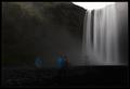
| 08/01/2005 07:50:14 AM | Dreamingby PippiComment: '7' - I like the concept of this, even without the 'couple'.. now that I think of that I think this would be a better photograph without couple, in my opinion. Because, that angle you have and the size of the fall and the cliff face etc, makes for a very ahh 'mammoth', almost 'looming' kind of feel. Criticism (with the caveat I know squat about long exposures); whilst I do like the colors, perhaps more contrasting on the pebbles, or again, an even tighter (ground level) angle, to incorporate 'some' of the pebbles, giving even more perspective, would make this a better photograph in my opinion. Just if you were able to get that green on the cliff face a little 'bolder', and the gray of the pebbles, would make it a more dramatic shot in my opinion. As for the shot as it is (with the couple, and that 'dreaming' theme to fit with your idea for the Challenge), my first thoughts were that the blue jacket was not subtle like 'hers' and therefore detracts from the mood and feel of this photograph. In this instance, perhaps b/w would have worked better. The concept is a nice one though and does have a romantic type feel.. the only other criticism would be with the male, in his 'solo left' shot, he is looking at the camera and I think if he were looking at her (as she seems to be looking at him?), it would have made this a better photograph in my opinion. | | Photographer found comment helpful. |
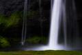
| 08/01/2005 07:41:05 AM | Waterby gudbjargarsonComment: '8' - Nice shot. I can't tell if it is the light on the water or the lighting is as a result of the long exposure, but I like the effect it has on that main stream. Criticism (with the caveat I know squat about long exposures); This is just a fraction dark in my opinion, I would love to see that green, especially in the foreground really stand out 'luminously'. The colors are simple though and that is nice. I wondered when I first looked at this whether it may have looked better (in my opinion) if it were cropped to remove that far left 'stream'.. not sure. Also, the top of the fall included, perhaps, if it is any good, but that would likely change the whole photograph. It portrays a 'cold feel' (as in temperature) in my opinion. Nice capture of the location. | | Photographer found comment helpful. |
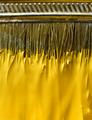
| 07/31/2005 11:11:26 AM | Yellow !!by mikalaComment: 5 - DMC. I do really like this shot, the texture of the paint, the bristles and the great color, but in my opinion, there is only one tool here. Paint in my opinion is a 'material' not a tool. Good shot, which is why I am commenting, but DMC. | | Photographer found comment helpful. |
| 07/31/2005 11:08:16 AM | Screw scienceby blue_dragonComment: 7 - Met the Challenge 'just' (I can't identify a trade here), and the jury is out on whether a screw is in fact a tool. This is a good shot though and creative and given the angle and detail you have made them look like little tools, so in my 'books' it just scraped in. Criticism; I would like to see the 'line up' completely in synch, that one in the third row second back needs to be uniform. I like the way the one right fore is on the side showing the 'face' and I like the light on it. The colors, while 'nice' I think detract a little from the metal aspect of the subjects. Perhaps a different color, or even b/w - though I think you would have lost the screwdriver more if you did that. I like the reflections (looks like a veiling of water?) and the depth. If the 'edges' of the 'studio' (or maybe it is just the crop) were more symmetrical, or out of frame, it would make this a better photograph, in my opinion.
EDIT: Just re-read Challenge desc, seems nails are 'tools' so I guess screws are too so... 'ok'... 8 | | Photographer found comment helpful. |
| 07/31/2005 11:02:15 AM | Sprinklersby louisdvComment: 4 - DMC. There is barely one 'tool' here and no related trade either (unless they are pretend gardeners). I like the concept a lot and the effects you have achieved have good potential, nice background too...... but for me, meeting the Challenge is the priority therefore I won't comment further. | | Photographer found comment helpful. |
|
Showing 3971 - 3980 of ~4217 |
Home -
Challenges -
Community -
League -
Photos -
Cameras -
Lenses -
Learn -
Help -
Terms of Use -
Privacy -
Top ^
DPChallenge, and website content and design, Copyright © 2001-2025 Challenging Technologies, LLC.
All digital photo copyrights belong to the photographers and may not be used without permission.
Current Server Time: 04/09/2025 01:52:28 PM EDT.
|