|
|
|
Showing 3981 - 3990 of ~4217 |
| Image |
Comment |
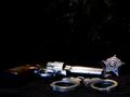
| 07/31/2005 10:48:43 AM | Police Officerby cpickettComment: 6 - Met the Challenge. I like the concept of this photo. The colors of the subjects are good. Criticism; In my opinion, the background detracts, the smoke also detracts and would look better if there was nothing behind it (ie the badge). The cuffs are not in focus and for me if they were and more sharpness on all subjects, would have made this a better photograph in my opinion. Also, perhaps if they were 'propped' up, with something under the 'backing sheet', otherwise just a different angle perhaps. The top half of the photo is wasted in my opinion, so perhaps a different crop, just more detail on the 'tools' I think would have been better. |  Photographer found comment helpful. Photographer found comment helpful. |
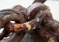
| 07/31/2005 10:31:00 AM | Shackle and Eyeby TallblokeComment: 6 - Met the Challenge, barely. I deciphered the cable, and 'shackle and eye' as toolS. Hard to tell with all the rust, and on that note, very good texture. Criticism; more overall focus, perhaps a touch less lighting at the top. | | Photographer found comment helpful. |
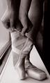
| 07/31/2005 10:17:28 AM | Dancer's Necessitiesby pidgeComment: 4 - DMC. There is only one 'tool' here. It is a nice photo and the b/w works well in my opinion, but for me, meeting the Challenge is the priority. | | Photographer found comment helpful. |
| 07/31/2005 08:58:27 AM | Waiting for sunsetby cleversonComment: 8 - Meets Challenge (2 x tools, camera and tripod) and for me, I am 'imagining' a professional photographer (trade). Fantastic vista. Criticism; I would like to see more of a focus on the tools for the Challenge aspect. Perhaps even without the photographer there, not sure. If the lighting were just on the 'plain', it would make this a much better photograph in my opinion. The shadow at the left fore, either out or played into more. Would like to have seen a 'closer from the edge' shot too. The greeny/gold of the 'plain' (hard to decipher) looks almost surreal and as I said, if that could be emphasized and the eye 'drawn' there even more than it currently is (for me), would make this a better photograph in my opinion. Not sure about the black top/bottom 'frame', but seeing as it is a semi panorama, it is likely most apt. | | Photographer found comment helpful. |
| 07/29/2005 08:14:17 PM | Old Man...Old Toolsby sajinComment: 7 - Met the Challenge. Good character here. Criticism; I wonder how this would look in sepia. For me, if there was more depth of field (and yes I realise you might lose the tools at the rear) it would make it a better photograph in my opinion. I just noticed his 'headband' and his shirt - well that's different. The shot is just a little dark in my opinion and therefore the tools are getting 'lost'. A sharper focus, maybe a different angle (sacrificing the tradesman), may have made this a better photograph in my opinion. Given the sign "...products on sale", perhaps even a 'ground level' angle incorporating that and gaining the mentioned DOF may have given this an edge. | | Photographer found comment helpful. |
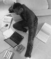
| 07/29/2005 07:58:15 PM | paperback writerby LindenComment: 8 - Met the Challenge (including the portrayal of 'thought'). Nice clean composition and simple, the b/w works well in my opinion. Criticism; maybe a slighter more diagonal/fly on the ceiling angle. The foot in frame. On thinking, I am wondering how you got this angle, well done either way. If this was 'set up', I can see a lot of thought went into the composition and the 'material used'. | | Photographer found comment helpful. |
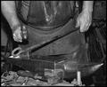
| 07/29/2005 07:52:39 PM | Bending Steelby docurrieComment: 6 - Met the Challenge. Good composition and concept. Good character. Criticism; Whilst I like the b/w, in this instance, given the (presumed) uniformity of colors 'in and around', I wonder whether color may have been better. The anvil is in focus but a touch of 'blur' in my opinion, and I would like to have seen more 'definition' on the 'action' somehow. The fore tools need focus or cropping in my opinion. Camera dependent, to gain some 'stop action' on that hammer (though I am sure it is moving fast) would have made this a very good photograph and capture. A little more depth of field perhaps (I just noticed the 'metal bars' in the background), so a different angle, would have made this a better photograph in my opinion. Mean looking anvil, somehow incorporating that even more, would have been good too. | | Photographer found comment helpful. |
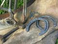
| 07/29/2005 07:43:57 PM | Farrierby fellajrComment: 7 - Met the Challenge. Nice composition and capturing of the colors. Criticism; Whilst I like the colors, the grass for me is a little distracting/detracting, so I wonder about b/w or sepia. Alternately, if either the grass filled 'a corner' more or even gave a top/bottom 'frame' of sorts, perhaps this could have worked well. That far tool in the grass needs to be in frame, and there seems to be 'something' just above the 'foot' of it, perhaps a twig not sure. I think this photograph could work 'blurred' as well, but for me, I would like to see a sharper 'edge' to the tools, including the leather. That bottom left tool (no idea the name), in my opinion, needs to be either all in or 'half out'. I like the angle, though a slightly sharper one might have given more of a 'feel' to the metal of the tools. | | Photographer found comment helpful. |
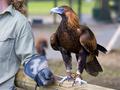
| 07/29/2005 07:29:09 PM | First, catch your humanby neehaiComment: 7 - Met the Challenge - If I could not see the handler and they did not look like this was their 'trade' then the jury would still be out, but this is a 'pass' in my books. Criticism; it is an excellent photo of the eagle, but for this Challenge, in my opinion, that should not be where the 'focus' is. Final side note on that, the talons look great, especially against that lovely grain. As I say though, in MY opinion, this Challenge is not about (in this case) the bird, it is about the 'tools', which you have captured. I would like to have seen more focus on the tools, more detail. Had this at 6 but on closer inspection/scrutiny, up to 7. If the 'tools' were 'main focus', 8. Maybe in this instance, for this Challenge, those talons and the 'tools' by themselves - that would have made a superb photo. | | Photographer found comment helpful. |
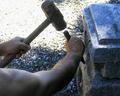
| 07/29/2005 07:22:53 PM | Hammers On Stoneby KOKOCATComment: 7 - Met the Challenge. I really like the concept of this and the originality. Criticism; Although you get a 'first hand' perspective here with this angle, and it may be that it is most apt for the Challenge, I would like to see more of a front on angle showing what is being carved/etched/etc. There is too much 'arm' from this angle in my opinion. The top left gravel is too blown out and the lighting around the tone and tools is 'off'. I would like to see more detail in the work being carried out and perhaps even just the hands in the frame along with the 'material'. Perhaps even a b/w of this, not sure. Good originality and thinking to get this 'trade'. | | Photographer found comment helpful. |
|
Showing 3981 - 3990 of ~4217 |
Home -
Challenges -
Community -
League -
Photos -
Cameras -
Lenses -
Learn -
Help -
Terms of Use -
Privacy -
Top ^
DPChallenge, and website content and design, Copyright © 2001-2025 Challenging Technologies, LLC.
All digital photo copyrights belong to the photographers and may not be used without permission.
Current Server Time: 04/09/2025 01:47:42 PM EDT.
|