| Image |
Comment |
| 08/12/2005 08:27:29 PM |
1968by GeneralEComment: It seems a little bit too contrasty or oversharpened for my taste |
 Photographer found comment helpful. Photographer found comment helpful. |
| 08/12/2005 08:26:54 PM |
|
| Photographer found comment helpful. |
| 08/12/2005 08:26:26 PM |
1959by danderson107Comment: I really like the simplicity of this image but it doesn't really have a lot of appeal for me. maybe it would look better if you used the rule of thirds? |
| Photographer found comment helpful. |
| 08/12/2005 08:25:25 PM |
1931by TammerComment: i think this would have been more effective in black and white and with a tighter crop to get rid of the skyscrapers in the background |
| Photographer found comment helpful. |
| 08/12/2005 08:22:43 PM |
0538 B.C.by bamihooComment: creepy. i have a picture from my trip to the louvre that looks EXACTLY like this. Is that where you took it? |
| Photographer found comment helpful. |
| 08/10/2005 01:18:05 AM |
|
| Photographer found comment helpful. |
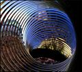
| 07/10/2005 12:40:03 PM |
"Going for a Spin"by sfarrell23Comment: A lot of slinky pictures but I like this one the best. I think it would be even better if you stuck something at the bottom of the slinky so it looks like the circles are leading somewhere. |
| Photographer found comment helpful. |
| 07/10/2005 12:37:06 PM |
|
| Photographer found comment helpful. |
| 07/10/2005 12:34:00 PM |
Tee Timeby KrozarComment: Fits the challenge but uninteresting composition and lighting is too harsh for my tastes. Try using the rule of thirds to spice it up and finding a place where the lighting is more diffuse. |
| Photographer found comment helpful. |
| 07/06/2005 10:43:01 AM |
Gone Fishingby Nikolai1024Comment: I like the picture a lot but I think it might be stretching the theme. would you really consider the rings on the fishing rod to be one of the main themes? 6 |
| Photographer found comment helpful. |
Home -
Challenges -
Community -
League -
Photos -
Cameras -
Lenses -
Learn -
Help -
Terms of Use -
Privacy -
Top ^
DPChallenge, and website content and design, Copyright © 2001-2025 Challenging Technologies, LLC.
All digital photo copyrights belong to the photographers and may not be used without permission.
Current Server Time: 04/18/2025 08:12:08 AM EDT.