| Image |
Comment |
| 06/19/2009 12:16:14 PM |
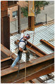
Wrestling with Steelby citymarsComment: Wish the angle was from the front, so we could see his face. But even as is, it's a strong image - excellent sense of energy in it, a feeling of real construction. Well done. |
 Photographer found comment helpful. Photographer found comment helpful. |
| 06/19/2009 12:15:11 PM |
|
| Photographer found comment helpful. |
| 06/19/2009 12:14:45 PM |
|
| Photographer found comment helpful. |
| 06/19/2009 12:14:20 PM |
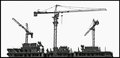
- Working Round the Clock -by andrewtComment: Very cool - the cloud texture keeps the sky from being so much empty space. I'd be curious how it'd look if you had gone vertical, and only showed the three towers, and not the stuff to the right - if this would have tightened it up even more. |
| Photographer found comment helpful. |
| 06/19/2009 12:13:10 PM |
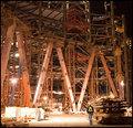
Never welding storyby ekmaiComment: Strong use of lines in the image, both the beams and the rails at the top & bottom. Maybe a touch more contrast, but otherwise quite nice. |
| Photographer found comment helpful. |
| 06/19/2009 12:11:48 PM |
Catby KarenNfldComment: Interesting image, but the angle could be better if it were more to the right - especially if it didn't clip the edge of the bucket off. |
| Photographer found comment helpful. |
| 06/19/2009 12:11:05 PM |
|
| Photographer found comment helpful. |
| 06/19/2009 12:10:45 PM |
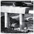
"Over there"by Yo_SpiffComment: The cement support has brighter tones than the workers, and thus draws the eye directly to it. Since it's not the main subject, nor very interesting, this takes away from the essence of the image. Perhaps a tighter crop would have been better. |
| Photographer found comment helpful. |
| 04/29/2009 09:27:40 PM |
stephanie.jpgby AndyMac24Comment: Great series, but I don't like this pose - the way her hips are angled out, and the way the left side of them blends with the chair before falling into shadows makes them look really big, much more so than the rest of her body - it's an optical illusion sort of thing, but I find it very distracting. |
| Photographer found comment helpful. |
| 03/11/2009 08:12:37 PM |
Princessby TCGuruComment: The skin tone here is really gray and makes her look like she's dead - I think the processing was off. |
| Photographer found comment helpful. |
Home -
Challenges -
Community -
League -
Photos -
Cameras -
Lenses -
Learn -
Help -
Terms of Use -
Privacy -
Top ^
DPChallenge, and website content and design, Copyright © 2001-2025 Challenging Technologies, LLC.
All digital photo copyrights belong to the photographers and may not be used without permission.
Current Server Time: 04/02/2025 02:43:59 AM EDT.