| Image |
Comment |
| 06/30/2006 01:56:02 AM |
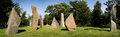
wheeler-ageofstone-web800.jpgby wheeleddComment: Interesting job on the stitching but I notice the rock shadows are not all going in the same direction. Did you mirror some of the shots to stitch them? Good colour intensity and nice clarity on the rocks. |
 Photographer found comment helpful. Photographer found comment helpful. |
| 06/19/2006 10:31:13 AM |
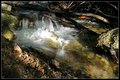
falls_color.jpgby justin_hewlettComment: I like this one the best of the water shots. The colours are more real and the highlight on the water, rather than looking blown out, looks to me exactly like a single ray of sun making it down to that spot and shining across the water. Strong shadows and contrasts. |
| Photographer found comment helpful. |
| 06/16/2006 04:50:47 PM |
Grabby UrfaKComment: Sorry, not sure what this is a blurry image of or how it depicts indulgence. |
| Photographer found comment helpful. |
| 06/16/2006 04:30:12 PM |
|
| Photographer found comment helpful. |
| 06/16/2006 01:11:59 AM |
Strawberry Indulgenceby Friskycat3Comment: Good subject choice. Lighting is a little harsh so if leaves the shot very flat. Maybe an indirect light source off to one side would have worked better to bring out the shadows and highlights of the subject. |
| Photographer found comment helpful. |
| 06/16/2006 01:08:33 AM |
|
| Photographer found comment helpful. |
| 06/16/2006 12:56:31 AM |
Too hard mathematics ?by ReM_FrComment: Good fit for the unnecessary part of the description! Nice clear focus and good composition. My only suggestion might be to raise the calculator a bit to help tone down the glare on the lighter surfaces. |
| Photographer found comment helpful. |
| 06/16/2006 12:52:51 AM |
Her Indulgenceby scarbrdComment: I like the concept you are going for. The lighting is very harsh and doesn't do a lot for the shot; the foot and bubbles are almost lost because of it. |
| Photographer found comment helpful. |
| 06/13/2006 01:06:11 AM |
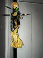
Occult Balance (Off Centered)by posthumousComment: Looked at this one and the original. The lighting in this one is rather flat compared to the original. Yes, the door is now white but you are missing the interest of the shadows that was there before. I think the closer crop would work well if you still had the same lighting as before. I actually liked the colour in the original better too because the green of the beads showed more, but that's just me. |
| Photographer found comment helpful. |
| 06/12/2006 11:41:46 PM |
Oxide, Clouds and Woodby lsmartComment: I like this one better than the B/W version. The muted colours in the sky makes a nice complement to the rusts of the old machinery. |
| Photographer found comment helpful. |
Home -
Challenges -
Community -
League -
Photos -
Cameras -
Lenses -
Learn -
Help -
Terms of Use -
Privacy -
Top ^
DPChallenge, and website content and design, Copyright © 2001-2025 Challenging Technologies, LLC.
All digital photo copyrights belong to the photographers and may not be used without permission.
Current Server Time: 03/12/2025 03:55:59 PM EDT.