| Image |
Comment |
| 07/30/2010 04:19:34 PM |
21-52by salmiakkiComment: Wonderful. Great natural, happy expression on the gal. The reflection allows the photo to transcend beyond "snapshot". The framed images work well as an added, but repeated motif (echoed nicely by your "frame"). Tiny nitpick, if you can save the middle shot from blowing in processing and find the detail to allow the mat to separate from the top of the picture, I think it would improve the flow of the BG. |
 Photographer found comment helpful. Photographer found comment helpful. |
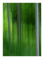
| 07/30/2010 04:17:03 PM |
Into the Woodsby salmiakkiComment: Oooh, very enjoyable abstract. I love green and you have a very nice hue here. The abstract flows well with the heavier (larger) band on the left being balances by more smaller bands. Overall I get a sense of fantasy. The wood is real, yet offers the hope of the fantastic. Fairies, magic, etc. |
| Photographer found comment helpful. |
| 07/30/2010 04:14:49 PM |
Early Evening Tranquilityby salmiakkiComment: Let's start with a 5.5 landscape. That score usually means promise, but with room for improvement. I think you've found a nice scene and have good clouds to boot. Clouds, I have learned, are hugely important to the overall work. One think I do not like at all in my own landscapes is to have branches creeping in on the sides. You suffer from this here and walking past the branch probably could have kept a very similar composition without it. Alternatively I'll even cut them down (if they are small enough) or have someone hold it out of the way. The color in the water is great. |
| Photographer found comment helpful. |
| 07/30/2010 12:17:35 AM |
Orbtasticby JustCareeComment: Finally, the piece de resistance! Your first 6+ image. You chose an excellent crop with just the right amount of negative space. The colors are not oversaturated like your sunset. They also are nicely complimentary. If I were to change anything, I would wish the texture of the cloth(?) was not there and those colors were smoother. |
| Photographer found comment helpful. |
| 07/30/2010 12:15:25 AM |
Look Into My Eyesby JustCareeComment: Self-portraits are fun, aren't they? Well, they CAN be fun anyway. The main issue with this shot is not your pose or you but the color cast. It is very red/yellow overall and that keeps your wonderful hair from standing out. It becomes one more red thing in a host of other red things. |
| Photographer found comment helpful. |
| 07/30/2010 12:12:58 AM |
waterby JustCareeComment: When I first started shooting sunsets and landscapes I would have done something like this. The picture is about the sunset and nothing else. It's also saturated to the edge of insanity. Don't worry. These are common ways to start. We've all done it. The next step is to shoot the picture so it is about something else WITH a great sunset, even if that something is a small, but interesting foreground object. Finally, you'll find out that the best sunsets are the ones with interesting clouds. You can't control this, of course, but you'll start to recognize beforehand whether there is promise in the evening's show. |
| Photographer found comment helpful. |
| 07/30/2010 12:08:01 AM |
And YOU think YOUR day was BAD?by JustCareeComment: This shot actually has some promise. I enjoy the color of the orange eartags as they stand out against the black and white of the cows. I may have cropped the top a little tighter; somewhere between the top of the cows back and the top of her head. Finally, do you sharpen your pictures at all with processing? This shot looks a bit soft. I don't think it's your lens since you had it stopped down to 5.6 and your shutter speed was likely fast enough. Applying some USM would be helpful. But your ability to see the promise of this shot was good. |
| Photographer found comment helpful. |
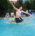
| 07/30/2010 12:03:50 AM |
Splish Splashby JustCareeComment: Let's start near the bottom of your scores. We can find good ways to improve these. First, I see by your comment that this was a set-up shot. Good. BUT, since you set it up, you should also set up your background. Ask yourself, does that part of the background add or distract from the subject? I'd start by asking the bald-headed gentleman to remove himself from the pic. He only takes out eye away from the action. The rest of the BG isn't bad, although I'd probably have moved the net and pole too. |
| Photographer found comment helpful. |
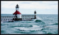
| 07/29/2010 03:33:46 PM |
~ St. Joseph Lighthouse ~by Ja-9Comment: Most people will tell you to put the horizon on a rule-of-thirds line, but I often don't. Perhaps I'm giving you bad advice, but I think this would be good with a fairly even split between sea and sky. However, I would only recommend this if you could capture more detail in the clouds. HDR is made for shots like this and if you haven't explored it, I'd suggest it. You don't need photomatix or something, but rather just manually blend the two exposures in photoshop (one for the sky, one for the rest). I think shot had a ton of potential (as the site has shown with ribbons for this particular lighthouse). |
| Photographer found comment helpful. |
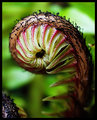
| 07/29/2010 03:29:56 PM |
Fiddle deby Ja-9Comment: Don't you just love these things? Did you hand-hold this? If you had a tripod with you, it would have probably helped to increase the f-stop so as to get more of the subject in focus. Lots of times a shallow DOF can be good in macro, but I don't think it helps you here. If you know you are shooting for DPC and you don't have a tripod a trick is to pull back and then crop later. The further you pull back, the wider the DOF becomes while keeping the same shutter speed. |
| Photographer found comment helpful. |
Home -
Challenges -
Community -
League -
Photos -
Cameras -
Lenses -
Learn -
Help -
Terms of Use -
Privacy -
Top ^
DPChallenge, and website content and design, Copyright © 2001-2025 Challenging Technologies, LLC.
All digital photo copyrights belong to the photographers and may not be used without permission.
Current Server Time: 04/18/2025 06:15:31 PM EDT.