| Image |
Comment |
| 10/29/2008 05:14:14 PM |
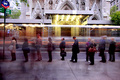
Waiting For The Busby Five_SeatComment: I wanted to give this another opoint. Things that would have counted are; Rotation, getting the horizontal correct (left 1.3deg) and maybe using Thirds a little to move the strong focal centre of the image slightly to the right. The short fat man framed by the strong gold of the building entrance could make this a serious robbon contender if a large portion of the pavement was gone and the right crop was just behind the girl with the shoulder bag. |
 Photographer found comment helpful. Photographer found comment helpful. |
| 10/29/2008 05:02:00 PM |
|
| Photographer found comment helpful. |
| 01/26/2008 11:55:13 PM |
|
| Photographer found comment helpful. |
| 01/26/2008 11:46:23 PM |
Who Ewe Looking At?by jonfrommkComment: The camera blur and perhaps the over-saturation have soiled this a bit but I like what you were trying to do here |
| Photographer found comment helpful. |
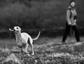
| 01/26/2008 11:45:10 PM |
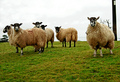
6...is not the loneliest number ;)by laurie241Comment: The caption actually spoils the image I think (no points lost though).
The brass/gold/brown tonings and the subtle and economical use of light really work here. |
| Photographer found comment helpful. |
| 01/26/2008 11:43:27 PM |
|
| Photographer found comment helpful. |
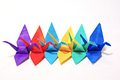
| 01/26/2008 11:42:45 PM |
Chain of Cranesby Pug-HComment: Nice work. Very creative. Photographically not strong for me, I'm thinking more impact would be had from a black background. What looks to be happening is that the white is reflecting 'fill' into all the cranes and flattening it |
| Photographer found comment helpful. |
| 01/26/2008 11:39:57 PM |
Six legsby TacTZillaComment: Actually a great shot using depth of field (bokeh) and shutter speed. It's a pity that it's really a bit of a stretch for this challenge. |
| Photographer found comment helpful. |
| 01/26/2008 11:38:03 PM |
Six O'Clockby PGerstComment: This is a strooong image:) The limited lighting, the mood and the aged patina of the clock all work. I usually don't like centred images, I don't think it's wrong in this case at all. |
| Photographer found comment helpful. |
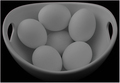
| 01/26/2008 11:18:58 PM |
Half-A- Dozenby sfmorrisComment: I'm not sure this quite works. The very flat contrast has made it have a sort of flat impact. What does a higher contrast one look like? |
| Photographer found comment helpful. |
Home -
Challenges -
Community -
League -
Photos -
Cameras -
Lenses -
Learn -
Help -
Terms of Use -
Privacy -
Top ^
DPChallenge, and website content and design, Copyright © 2001-2025 Challenging Technologies, LLC.
All digital photo copyrights belong to the photographers and may not be used without permission.
Current Server Time: 04/02/2025 03:58:40 AM EDT.