| Image |
Comment |
| 08/31/2006 10:26:59 PM |
The Kissby SquishyBComment: Your background is quite distracting. Its unevenly lit and the texture of the wall is too obvious. The figurines are a poor candidate for a silhouette because of all of the reflections from the surface. Emotionally, this has no impact on me as I'm having trouble making any connection with the figurines. Had these been real people, I think the passion would show much more. |
 Photographer found comment helpful. Photographer found comment helpful. |
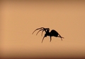
| 08/31/2006 10:20:19 PM |
Waitingby astrogeekComment: You need a better focus on the spider -- I can just see hints of hairy legs, but nothing on him is sharp. Also, a bit more contrast and focus might bring out the web better as well. Having done that, I'd crop out some of the negative space above the spider. Its not doing anything for the image. Most of the image should be spider and web. |
| Photographer found comment helpful. |
| 08/31/2006 10:07:34 PM |
Red Eye Flightby AppleFunkComment: Looks like you've got a bit of motion blur either on the bird or your camera or both. I like both the composition and colors. This could've been improved with a faster shutter speed, IMO. |
| Photographer found comment helpful. |
| 08/31/2006 10:03:42 PM |
|
| Photographer found comment helpful. |
| 08/31/2006 10:00:16 PM |
Without Youby nsharpComment: Your subject is well lit, but the background needs some work -- I can see the wrinkles in the sheet. You need to step away from it a few feet so it will be out of focus, and the imperfections in the sheet not as obvious. |
| Photographer found comment helpful. |
| 08/31/2006 09:34:25 PM |
Three Gracesby ZoomdakComment: I really like the rock/tree combination on the left. I think you would have made a much stronger shot by eliminating the other rocks and including the single rock with the tree and the moon. |
| Photographer found comment helpful. |
| 08/31/2006 09:32:52 PM |
Nightfallby WadeComment: I like the composition, but I don't like what you appear to have done in post-processing. Parts of it look very grainy, others look over-smoothed or blurred. |
| Photographer found comment helpful. |
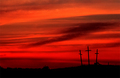
| 08/31/2006 09:30:36 PM |
The Place of the Skullby philupComment: I really like the concept your going for here. The red really sets the scene well. I think you could improve this by getting closer to and under the crosses. With the threatening red sky I feel like the crosses should be towering over the picture, rather than occupying the corner. |
| Photographer found comment helpful. |
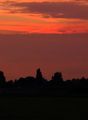
| 08/31/2006 09:22:51 PM |
Heading Homeby drj0037Comment: Nice colors and composition. The focus seems a touch off as nothing looks sharp. |
| Photographer found comment helpful. |
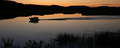
| 08/30/2006 09:30:18 PM |
Watching the Stormby irishblueComment: I like idea here. I think a slightly lower angle on your model to eliminate some of the tracks in the sand and draw the eye out to the waves would help this. |
| Photographer found comment helpful. |
Home -
Challenges -
Community -
League -
Photos -
Cameras -
Lenses -
Learn -
Help -
Terms of Use -
Privacy -
Top ^
DPChallenge, and website content and design, Copyright © 2001-2025 Challenging Technologies, LLC.
All digital photo copyrights belong to the photographers and may not be used without permission.
Current Server Time: 03/12/2025 01:23:12 AM EDT.