| Image |
Comment |
| 09/22/2010 07:31:18 AM |
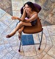
d'en hautby CoryComment: While the angle of the camera is very unusual, it makes the subject look very short and small, especially with so much background. As such, I don't think I like the angle of this. Did you HDR the floor? It looks kinda funny and I think it takes away from the model. |
 Photographer found comment helpful. Photographer found comment helpful. |
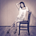
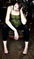
| 09/22/2010 07:29:05 AM |
Nicaby bryanbrazilComment: The expression on the face of the subject makes me think she was very uncomfortable in front of the camera. Since the expression of the subject can make or break the atmosphere of the image, I would have chosen a pose where the model's face was more relaxed or calm. I'm also not a fan of the processing, but I do like the clean textures of the floor and the background. |
| Photographer found comment helpful. |
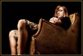
| 09/22/2010 07:26:56 AM |
Ommmmm...by dgodardComment: The chair and the pose fit very well with the light. The shadows on the wall behind the subject also add some very nice atmosphere. The only thing I would change would be to move the camera (or the subject and chair!) to eliminate the small piece of window on the side, which makes that part of the image a little too cluttered for my taste. |
| Photographer found comment helpful. |
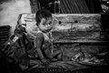
| 09/22/2010 07:23:46 AM |
My mother  by svavaComment: I find the bag very distracting because it is so bright, especially compared to her face. It looks like her hands are brighter than her face too, which I'd guess to be a result of how you converted to black and white. That said, I think the tones are otherwise lovely and I think her expression is very fitting. |
| Photographer found comment helpful. |
| 09/22/2010 07:22:13 AM |
Vulnerableby CitadelComment: I love the spotlight under/behind the chair. I think the side light (photo's right, subject's left) lights too much. If you put it a bit more behind him, it would have given more of an edge light, which would create a slightly darker image that would better fit the title. I think I might have moved the main light more to his side as well, for the same reason. I think there is too much light on him for him to still be considered vulnerable. |
| Photographer found comment helpful. |
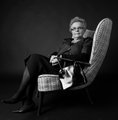
| 09/22/2010 07:18:45 AM |
How Comfortable Art Thou?by denboteComment: I wish you had pulled up the whites a bit more to add a bit more contrast. As it is now, the brightest parts of the image are still very grey. Still, nice photo and composition. |
| Photographer found comment helpful. |
| 09/22/2010 07:17:42 AM |
Smilesby ScooterMcNuttyComment: The light on her is very beautiful and I love the texture of the floor, but I'm distracted by the things in the background. |
| Photographer found comment helpful. |
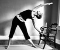
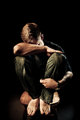
| 09/22/2010 07:16:51 AM |
still have some years leftby libertyComment: As weird as this is going to sound, the nice light on his legs and the fact that they are so large in the frame makes me drawn to his legs instead of his face. It also doesn't help that half of his face (namely one of his eyes) is covered by his hair. They eyes are a major draw in an image, so covering them up takes away a huge focus point in the frame. |
| Photographer found comment helpful. |
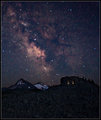
| 09/17/2010 05:12:08 AM |
The stars twinkle in eternal silence...by DrAchooComment: The sky looks so magical. It's crazy that so many people have never seen this is real life because they live in a town with more than 10 people who have lights on their houses and streets. |
| Photographer found comment helpful. |
| 08/01/2010 02:16:49 PM |
|
| Photographer found comment helpful. |
Home -
Challenges -
Community -
League -
Photos -
Cameras -
Lenses -
Learn -
Help -
Terms of Use -
Privacy -
Top ^
DPChallenge, and website content and design, Copyright © 2001-2025 Challenging Technologies, LLC.
All digital photo copyrights belong to the photographers and may not be used without permission.
Current Server Time: 04/21/2025 06:18:38 AM EDT.