| Image |
Comment |
| 03/26/2010 11:19:18 PM |
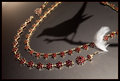
La Gazza Ladra (The Thieving Magpie)by gyabanComment: Wonderful idea! You could have put a few more reflectors around the jewelry (not to light them more, but to create more catch lights in the stones) to make this even better. |
 Photographer found comment helpful. Photographer found comment helpful. |
| 03/26/2010 11:19:14 PM |
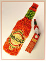
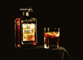
Tabasco- made with peppersby kellmak10Comment: I can definitely see this in a magazine ad. Great gob! I might whiten the whites a bit more, but otherwise this is very well done. |
| Photographer found comment helpful. |
| 03/26/2010 11:19:11 PM |
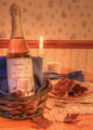
Chardon'A The World's Finest Maple Syrupby thatsanicepictureComment: Very nice set-up, colors, and processing. It all gives a great mood to the image. The only little changes I would make are to straighten the horizon line and to move the candle so it doesn't look like the napkin is about to catch fire : ) |
| Photographer found comment helpful. |
| 03/26/2010 11:18:43 PM |
|
| Photographer found comment helpful. |
| 03/26/2010 11:17:18 PM |
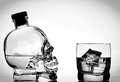
On the Rocksby MinsoPhotoComment: Gorgeous light on the glass! My only nit-pick is that the top of the bottle blends into the background. Add a small rim light/back light and problem solved : ) |
| Photographer found comment helpful. |
| 03/26/2010 11:17:15 PM |
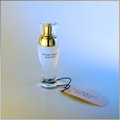
Her Secretby vikasComment: Very pretty and clean. The mood definitely fits the product.
Two tiny little nit-picks:
I would have removed the stem from the bottle. I know it is part of the product, but it seems out of place. A lot of ads remove the stems to make the bottles look cleaner.
In product photography, it is very important to get the color perfectly accurate. I love the colors of the background, but I suspect that the stuff inside the bottle is white, not pink or blue, and that that color comes from the background.
I'm not voting you down on either of these things, but I thought I would mention it anyway : ) |
| Photographer found comment helpful. |
| 03/26/2010 11:17:13 PM |
Crystal Head Vodka by KarenNfldComment: Very clean! The only thing I would have removed is the writing on the skull, but, of course, it's hard to say whether or not the SC would deem that a large part of the photo. In product photography, they never leave that in though. |
| Photographer found comment helpful. |
| 03/26/2010 11:16:45 PM |
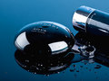
Bulgari Aqua by h2Comment: Beautiful! I wish the water drop was a tiny bit sharper--it was difficult to tell what it was at first. |
| Photographer found comment helpful. |
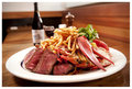
| 03/26/2010 11:12:44 PM |
Omaha Steaks ... Let's go Surfin!by pawdrixComment: Looks very appetizing! I would have preferred to see a steak sauce bottle in the back instead of wine. I don't think wine fits the "Omaha Steak" brand. Otherwise, this is a wonderful food shot! |
| Photographer found comment helpful. |
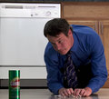
| 03/26/2010 11:09:33 PM |
It is that easyby AtsugiComment: The light on his face looks very dull. The dishwasher is also the brightest thing in the photo when it should be the Comet. Adding a rim light to the Comet might make it stand out better, but I would also put a little more light on the front. This is a good idea, but I think it would have been better received with some better lighting. |
| Photographer found comment helpful. |
Home -
Challenges -
Community -
League -
Photos -
Cameras -
Lenses -
Learn -
Help -
Terms of Use -
Privacy -
Top ^
DPChallenge, and website content and design, Copyright © 2001-2025 Challenging Technologies, LLC.
All digital photo copyrights belong to the photographers and may not be used without permission.
Current Server Time: 04/22/2025 05:59:29 PM EDT.