| Image |
Comment |
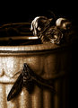
| 05/31/2009 04:09:01 PM |
Absolute Whiteby pixelpigComment: I love the painterly reflection in the back, but I think the garlic detracts from it. |
 Photographer found comment helpful. Photographer found comment helpful. |
| 05/31/2009 04:07:15 PM |
|
| Photographer found comment helpful. |
| 05/31/2009 04:05:41 PM |
|
| Photographer found comment helpful. |
| 05/28/2009 02:27:53 AM |
|
| Photographer found comment helpful. |
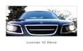
| 05/28/2009 02:26:13 AM |
BOLD MOVESby SEGComment: The saying at the top is great (props if you made it up yourself!), but I think the image would have looked a bit more bold with a less distracting background, particularly on the right. Maybe blur out the background? It might look cool with a gradient blur so it looks like an incredibly shallow depth of field. |
| Photographer found comment helpful. |
| 05/28/2009 02:17:13 AM |
|
| Photographer found comment helpful. |
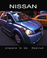
| 05/28/2009 01:29:27 AM |
VERSA-tilityby PennyStreetComment: I don't like the spacing or the strange sizes of the letters on the bottom, but I love everything else.Great color, great reflections, nice bold font for "Nissan," fitting distortion, and sharp detail. The crop on the back and top might be a little tight, but I even light the inclusion of the cab because that paired with everything else (distortion, reflections, etc) help make the point that the car is hip and great for a city. |
| Photographer found comment helpful. |
| 05/28/2009 01:23:35 AM |
|
| Photographer found comment helpful. |
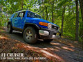
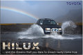
| 05/28/2009 01:10:05 AM |
At the end of the the rainbowby GlanniComment: Nice catch on that rainbow! You could probably crop in quite a bit and still save enough of the rainbow for it to have the effect you want it too. Why is "Toyota" written so small? It almost looks like you're trying to hide it up there. |
| Photographer found comment helpful. |
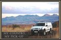
| 05/28/2009 01:07:33 AM |
My Country, My Pick-up.by AmmieComment: I love the background. Nice composition too (could work with or without some of the white sky, which is good if the ad needs to be cropped to fit into a space). The lighting on the truck is soft, but bright enough to keep the car as the focal point. The only part I don't like is the brown box around the text. |
| Photographer found comment helpful. |
Home -
Challenges -
Community -
League -
Photos -
Cameras -
Lenses -
Learn -
Help -
Terms of Use -
Privacy -
Top ^
DPChallenge, and website content and design, Copyright © 2001-2025 Challenging Technologies, LLC.
All digital photo copyrights belong to the photographers and may not be used without permission.
Current Server Time: 04/16/2025 07:29:32 AM EDT.