| Image |
Comment |
| 01/21/2006 04:32:02 PM |
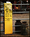
Catch Me If You Canby sherComment: Looks like there is still plenty of blank space on this sign for the owner to keep editing. Nice composition and border to help pull this one all together. |
 Photographer found comment helpful. Photographer found comment helpful. |
| 01/21/2006 04:30:51 PM |
Down an English Laneby Ian-AndrewComment: Nice composition... I like the angle and background clouds. The sign is a tad dark which makes it hard to read. Well done. |
| Photographer found comment helpful. |
| 01/21/2006 04:29:48 PM |
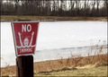
Sign Eating Treeby umbrisComment: How funny! Seems like an awful lot of black here, though cropping in on just the sign wouldn't look right either. Still trying to figure out what the sign said before it got eaten! |
| Photographer found comment helpful. |
| 01/21/2006 04:27:43 PM |
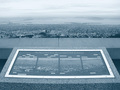
Panorama in 4:3by GeneralEComment: I'm not sure if I like the overall lack of color since it keeps it consistent with the sign, or if I would like to see more color in the top half. Creative shot and perfect for the challenge. Nicely done. |
| Photographer found comment helpful. |
| 01/21/2006 04:25:00 PM |
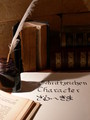
SIGNS AND SYMBOLSby knuffelComment: Nice composition. Has an old feel to it which I like. The dark parts are a bit too dark for me.. perhaps moving the light away a bit more? |
| Photographer found comment helpful. |
| 01/21/2006 04:23:26 PM |
Winterby barndogComment: What a face on that sign! Great for the challenge, and with the icy background it's even better. |
| Photographer found comment helpful. |
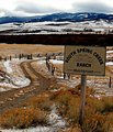
| 01/21/2006 04:22:37 PM |
Spring Creekby KivetComment: Beautiful shot. Love the line the road creates and the colors. |
| Photographer found comment helpful. |
| 01/21/2006 04:21:28 PM |
D P Cby BeetleComment: Great idea! I thought about doing this same kind of thing using 'a b c', but didn't have enough hands. I think I might have shown a bit more of the wrists, or somehow made the lines not as straight. Well done! |
| Photographer found comment helpful. |
| 01/16/2006 06:52:51 PM |
Saturday Nightsby C-town driverComment: Just came back to find your shot and leave you a comment since you were so kind and left everyone else comments on their shots for this challenge. I liked the bright colors here, but I think the lack of focus on the sign detracted from this one. |
| Photographer found comment helpful. |
| 01/15/2006 09:51:38 AM |
A sprinkle of sprinklesby burtctComment: Neat idea, but I think the colors came off a little flat here. Perhaps boosting the saturation and brightness a bit would help. I also would have loved to see a yummy cupcake under there for the sprinkles to fall on instead of a flowered background. |
| Photographer found comment helpful. |
Home -
Challenges -
Community -
League -
Photos -
Cameras -
Lenses -
Learn -
Help -
Terms of Use -
Privacy -
Top ^
DPChallenge, and website content and design, Copyright © 2001-2025 Challenging Technologies, LLC.
All digital photo copyrights belong to the photographers and may not be used without permission.
Current Server Time: 04/22/2025 03:13:39 PM EDT.