| Image |
Comment |
| 06/05/2015 07:59:11 PM |
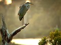
Heron at Sunsetby dtremainComment: Really odd crop, would have liked to see more of the area above the bird. Leaving a little a space gives the bird somewhere to go in the frame, just to crunched in like this. Most of all, the focus is just off and the entire photo is a little blurry. To bad because if focus had been spot on and a bit different crop this could have been a wonderful photo. |
 Photographer found comment helpful. Photographer found comment helpful. |
| 06/05/2015 07:53:36 PM |
|
| Photographer found comment helpful. |
| 06/05/2015 07:52:48 PM |
Osprey Nest Buildingby bobnospumComment: Just a little unsharp, not sure if its missed focus, slow shutter or heavy crop........to bad as it would have made a great photo otherwise |
| Photographer found comment helpful. |
| 06/05/2015 07:41:31 PM |
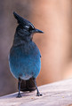
Stellar Jayby MaryOComment: Nice capture that could really benefit from some dodging around the eye to brighten it up and help draw attention to it a little more. |
| Photographer found comment helpful. |
| 06/05/2015 07:29:52 PM |
|
| Photographer found comment helpful. |
| 06/05/2015 07:26:25 PM |
|
| Photographer found comment helpful. |
| 06/02/2015 07:06:09 PM |
West Span by BrennanOBComment: Love the photo and not changing my vote, but just noticed this on the front page. Sure hope you used a different photograph for this one. As someone who always shoots in burst mode I know it's highly possible that it is. |
| Photographer found comment helpful. |
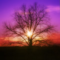
| 04/13/2015 09:50:35 AM |
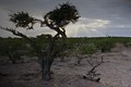
Hues of lightby bennettjamieComment: I did not vote in the last free study but this would have gotten a 5 from me. The color of the sky is amazing and just stunning, but other then that there really is nothing spectacular about the photo. I have been a fan of the square crop from my film days, but it has to be the right photograph to really make it work. In this case it does not, having the tree filling the entire frame and dead center is not a very interesting composition. If you would have used a different crop and backed up from the tree, putting it to one side of the frame it would have made a much more interesting composition and would have gotten a higher score from me. Without actually seeing it, I would guess I would have given you a 6 or 7 depending on how it looked. I entered a tree photo with a square crop, maybe if you had done something similar to this it would have done better.
 |
| Photographer found comment helpful. |
| 03/31/2015 11:15:14 AM |
|
| Photographer found comment helpful. |
| 03/10/2015 01:58:27 PM |
I love Canonby bennettjamieComment: Moved my reply on your thread to the photo:
To start with it has to be an exceptional photograph to do even decent in a free study and unfortunately this is not an exceptional photograph. Keep in mind this is my opinion about the photograph.
There is nothing that really pops and draw my attention, could use a little bit of punch in the colors so it is not so flat. The aperture is not enough to really blur the background (would have been better if she was farther away from the bushes) out so it's a bit busy. The image is also overall a bit soft. I would guess as a result of the slow shutter speed and being shot handheld (only guessing as I am not sure what focal length you selected or if a tripod was used). The softness would not be that much of an issue if the eyes were good and sharp but they are not and could use some dodging to lighten up the eye area to bring in the viewer. Would like to see a bit more space above her head, while I know that the rule of thirds can be broken I found that if you follow it (for most photographs) the composition is much better. Those are my technical things about the photograph. Those combined with just an uninteresting subject I can see why it did not do well.
Ronnie |
| Photographer found comment helpful. |
Home -
Challenges -
Community -
League -
Photos -
Cameras -
Lenses -
Learn -
Help -
Terms of Use -
Privacy -
Top ^
DPChallenge, and website content and design, Copyright © 2001-2025 Challenging Technologies, LLC.
All digital photo copyrights belong to the photographers and may not be used without permission.
Current Server Time: 04/19/2025 08:48:32 AM EDT.