|
|
| Image |
Comment |
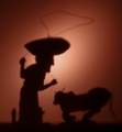
| 06/26/2006 02:41:46 PM | Mind the fingerby Rino63Comment: Greetings from the Critique Club
This is a funny, cheeky shot, that I'm sure not everyone appreciated. What I do not understand though, is that while you chose a slightly controversial subject, but then only implement is half heartedly. Why not give us the full finger? I know I would respect you more for it :P
I like the lighting from the side, although I think it might have been better if you lighted 'the finger' only from the left, to give it more depth. It's a bit two dimensional now.
The slight twist in the center frame was a good idea. It unbalances the photo, holding the interest a bit longer.
In the end I think the image is just not 'wow' enough for the DPC voters to give it high marks. That and I'm sure that you offended a few of them as well. |  Photographer found comment helpful. Photographer found comment helpful. |
| 06/26/2006 02:30:57 PM | Foreshadowingby zhekaComment: Greetings from the Critique Club
This image doesn't really speak to me. You could have spent a few more minutes setting up the shot. The pencils don't really line up, and there are few irregularities on the paper. When you have such complete control over the subject you are shooting, you should make sure that everything is as perfect as it can be.
I would also have liked it better if you could have achieved to have the shadows the same color, and if you got rid of the reflection in the shadow of the 3 o'clock pencil.
I do like the colors, although the paper could have been a more uniform color. I also like the depth of field you used. The focus on the pencil sharpener is good.
It meets the challenge very well, and the idea is quite original. I'm sure you would have scored a lot higher if you spent a bit more time in organizing the photo.
| | Photographer found comment helpful. |
| 06/26/2006 02:22:11 PM | Tattered Gloryby scarbrdComment: Greetings from the Critique Club
First impression of the shot is one to look a bit longer at the image, to find out what is going on. This is a good thing, you have captured the interest of the viewer. The lines of the roof draws the eye in to the flag, and the diagonal boarding behind it frames the vertical lines well.
I like the central composition. This is a good example that not every image needs to conform to the rule of thirds. Personally I think I would have cropped a bit more off the corrugated roof, maybe until the point where the roof meets the side walls, and shown a bit more of the railing at the bottom.
I like the post processing. The selective color treatment works well, and the grain gives it a more desolate feeling. Without it it wouldn't meet the challenge as well.
The bright spot at the bottom bothers me a bit, as do a few other places where the highlights are a bit blown. The bottom flare takes the attention away from the flag. Not sure what you could have done about it though.
The image meets the challenge in my opinion, but not as strongly as many other photographs in the challenge. I'm sure that cost you a few points.
Personally I would score this picture higher than the score you received, and I think the flag subject just isn't that popular. | | Photographer found comment helpful. |
| 06/24/2006 10:30:01 AM | Capturing a Bokeh Moonby smccComment: This is simply amazing. The colors, the lines of the webbing, the way the webs catch the light. So far the best shot I've seen in this challenge. Added plus: it is not a flower. | | Photographer found comment helpful. |
| 06/24/2006 07:18:53 AM | Hard Work in the Sun makes a Big Man.by bgslawComment: Greetings from the Critique Club
First impression and overall look:
Nice idea, but not overly well executed. For starters, there's too much noise in this image. I'm certain that NeatImage would work miracles on this photo. You can dowload a trial version //www.neatimage.com.
Second, the shadow of the bull is distorted. It would work better if it was perpendicular to the wall, to keep it sharp at all sides. Right now his bum is very fuzzy.
The bright reflection of the light I do not mind. It makes it appear that there is a setting sun in the image, silhouetting the cowboy and his bull.
Technical and post processing:
As said earlier, you really need more noise reduction here. Noise can add to an image, but this is not one of them. I would also put a bit more contrast in, darkening the shadows some more.
I can really tell if the photo is slightly out of focus, or if the shadows are fuzzy because of the distance of the figures to the wall, but that is definitely something to improve.
Meeting the challenge:
yes it does really meet the challenge. I fear that the technical part of the photo did you in.
How to raise your score:
A crisper image usually does better on DPC. NeatImage and a sharper shadow would help loads. | | Photographer found comment helpful. |
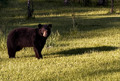
| 06/24/2006 07:05:45 AM | Bearly a shadow can scare me awayby ShutterPugComment: Greetings from the Critique Club
First impression and overall look:
Wow! Thank God I live in a country where the most dangerous animal is the boar. I wouldn't want to wake up and find that in my back yard. You're a brave person to make this shot at all.
That said, photo-wise there is something to be improved on the composition. While I understand that the challege was shadows, and therefore you wanted to include the shadow of the bear in your photo, it doesn't really add to the image. The fore and background you could also do less with. A tighter crop would lose the 'snapshot' feeling that this picture breathes. The problem with that then becomes that you would lose points for DNMC.
Technical and post processing:
Technically it's all fine. Lighting is OK, and I doubt a larger aperture would improve the DoF very much, although the image would be better with the background more out of focus. Cropping and bordering the image would make some difference.
Meeting the challenge:
Well, there is a shadow, but it's certainly not what you were aiming for in this image. This photo is about the bear and the shadow only comes second place.
How to raise your score:
The fact that the bear is the attention point and not the shadow certainly cost you a lot of points. I feel that this image would have done a lot better in a 'Wildlife' challenge than in the shadows challenge. All in all, this image is a bit too flat to score high. | | Photographer found comment helpful. |
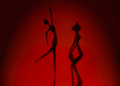
| 06/24/2006 06:15:48 AM | The Dance of the Shadowsby talikfComment: Greetings from the Critique Club
First impression and overall look:
I like this image from first view. It is a strong, simple image that invites to take a longer look. There are some small critiques however. The second figure has indeed a softer edge than the dancer. I realise the size difference made this necessary, but it's a shame really. The leg of the dancer is also softer than the rest of the figure.
In stead of having the sun castig the shadows in the red board, I wonder if you wouldn't have got a better result if you used a strong artificial light. Or backlight the figures through a red cloth, to capture the silhouettes.
The figures are also slightly out of centre. This is one image where symmetry would do well, I would personally choose for the empty space between the figures to be the centre of the image.
Technical and post processing:
Not much to say here. Technically all is well. The burning on the sides was a good choice. I do not thing the image would be as interesting without it.
Meeting the challege:
Definitely, and in an interesting way too.
How to raise you score:
Maybe the points I mentioned before would have given you a few extra decimals, which would normally place you well in the top ten. The problem with this challenge was that there were too many others scoring very high, which placed you on the second page. | | Photographer found comment helpful. |
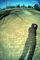
| 06/24/2006 05:58:41 AM | Shadows have a life tooby rishinicolaiComment: Greetings from the Critique Club
First impression and overall look:
Upon opening the phot I though 'hey cool, nice fisheye'. It immediately grabs your attentions and makes the eye follow the photo counterclockwise. After the shadow, it then meets some distracting fences and bushes though. These don't really do well in the fisheye perspective, in my opinion. After that the eye comes to the shadow of the tree, and that makes a fine closing argument for the picture. The two shadows balance each other out nicely.
Technical and post processing:
I wonder why you chose an ISO of 800 for this photo. There is plenty of light available, why not go for 400 or even 200? Next thing I noticed is that the photo is smaller than the maximum allowed size. Personally, I would always go for the largest size possible. It is much more relaxing to look at. File size is smaller than allowed too, although I don't see any artifacts here, so that's not really a problem.
The color of the photo is slightly shifted towards the green. A bit of photoshopping can correct that. Also, the colors are a bit flat, try upping the saturation a notch.
Meeting the challenge:
Does meet the challenge well, although I think you could have been a bit more creative. The fish eye is the only thing that gives this shot a bit extra interest, but apart from that, there's nothing much to see.
How to reaise your score:
There's not much of a wow factor in the shot. The fisheye is the only thing that makes it slightly interesting, but after that it falls a bit flat. DPC'ers like to be awed at a shot, and this shot is not one of them. Also, if the background were a bit more of interest it could give you a few more decimals. | | Photographer found comment helpful. |
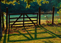
| 06/23/2006 06:54:16 PM | Evening at the Gateby swallaceComment: Greetings from the Critique Club
First impression and overall look:
First things that came to mind was: nice colors. Maybe a tad oversaturated, but apparently that does well on DPC. Second thing that came to mind was: hey! this is actually a picture of a shadow! Well done. Then came the rest. I like the late or early lighting. It does give that romantic feel that you were going for. I like the light on the leaves on the top. It frames the picture well. What I would have cropped out is the tree on the left and the bush on the right. And since this is an advanced editing challenge, I would also have cloned out the dirt mound at the back. It's distracting and doesn't add to the image.
Technical and post processing:
OptikVerve did a good job. The colors are indeed very romantic, and there is a softness in the image that many will find pleasing. The fence is a bit dark. Maybe a soft fill-in flash could have brought back some detail. Personally I might have tried a layer mask to blur the trees in the a bit more.
Meeting the challenge:
Yes it does. There is a pretty shadow, which is also the main focus of the image.
How to raise your score:
A neater enviroment could have helped you, although I realise that it would be hard to grow some grass quickly on the trodden down path. A better crop could have given you some extra decimals, but in the end I think the picture is just not interesting enough to score high with the DPC voters.
| | Photographer found comment helpful. |
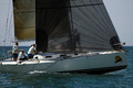
| 06/23/2006 06:24:57 PM | Sail Imagesby DrakeComment: Greetings from the Critique Club
First impression and overall look:
First impression was, nice weather. The photo makes me want to leave my desk and rent a boat for my own. There isn't much more I can say about it though. It's a nice picture of a boat, but it doesn't really hold my attention. It doesn't give the exilaretaing feel of a sailing trip, but more of a few people waiting for something to happen.
Composition wise I feel that having the back of the boat (is that 'aft'?) cropped is not a good idea, and I would have shown a bit more of the sails to give it a les centered appearance. The crew through the front sail that you wanted to capture is a bit lost, because you can't really see what he's doing.
Technical and post processing:
The boat is nice in focus, but you didn't capture the lighting at the best time. You can't really see any of the feces because they are all in shadow. Taking the photo at high noon (as this appears to be) makes the image rather flat.
Meeting the challenge:
Of course there are shadows present (aren't they always), but it's not the focal point of this image. I would even rule a silhouette as technically a shadow, but the guy through the sail is also not exactly in silhouette.
How to raise your score:
A few things. First, make sure that you at least superficially meet the challenge. There are people out there who would score a 1 alone on a DNMC vote.
Second, try to shoot at a different time, as high noon is not the best time of the day. The lighting is harsh, and the lack of shadows makes many an image just flat.
Third, make something happen in your image. These people are just sitting there. | | Photographer found comment helpful. |
Home -
Challenges -
Community -
League -
Photos -
Cameras -
Lenses -
Learn -
Help -
Terms of Use -
Privacy -
Top ^
DPChallenge, and website content and design, Copyright © 2001-2025 Challenging Technologies, LLC.
All digital photo copyrights belong to the photographers and may not be used without permission.
Current Server Time: 03/12/2025 02:34:01 AM EDT.
|