| Image |
Comment |
| 03/06/2008 02:49:00 AM |
|
 Photographer found comment helpful. Photographer found comment helpful. |
| 02/27/2008 05:14:36 PM |
|
| Photographer found comment helpful. |
| 02/27/2008 05:08:52 PM |
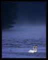
Just the Two of Us by scalvertComment: Ah, so many people go by the challenge name only, and not the challenge description. Plus, I think this picture evokes a sense of zen-like inner harmony anyway. So you were definitely good for this challenge. :-) That color blue is just amazing... really lovely. |
| Photographer found comment helpful. |
| 02/27/2008 02:01:04 PM |
|
| Photographer found comment helpful. |
| 02/25/2008 07:26:47 PM |
The Hiding Placeby NicNic101Comment: Awww, your piggie has the same colors as my piggy! My James is no longer here so it is really great to me to see this image, thank you :-) I love the pose and expression too - very adorable. |
| Photographer found comment helpful. |
| 02/25/2008 05:44:24 PM |
Ginnyby levyj413Comment: Aww, what a cutie-pie!! Guinea pigs hold a special place in my heart and I'm glad to see some in this challenge. Love the different-colored feet! |
| Photographer found comment helpful. |
| 02/22/2008 09:27:07 PM |
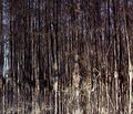
...On The Pondby 777STANComment: Critique Club Comment
I think it would be obvious to anyone who looked at this photo for more than two seconds that you did meet the challenge. I wonder, however, how many people did not look for that long and only saw a line of contiguous trees.
I like how you flipped it so that the reflection would be at the top. The leaf (I think it's a leaf) also helps draw us to the "reflection" idea, but it unfortunately is not in a place within the frame that draws the eye in a flowing fashion, rather it distracts a little (if that makes sense).
I agree with the comments that say that this is too busy. But I do like the detail that you've shown. Perhaps darkening the edges and blurring them a bit, and maybe lightening the center (bottom rightish) area some, would help us to focus on one part of the image rather than all parts. |
| Photographer found comment helpful. |
| 02/22/2008 08:59:40 PM |
Still life for the soupby toskComment: Critique Club Comment
I like this image - as mentioned previously, it is creative!
Composition is good - the knife and veggies are placed at a good point within the frame, and the background is balanced with the inside of the pot. Perhaps some viewers would have liked to see the pot not cut off at the bottom. This was definitely my first reaction.. after looking some more I decided I liked it the way you had it, but others may have stuck with that first impression.
Also mentioned previously was the sharpness. I agree that this is one area that the photo is "lacking". I don't find it too bad, but it definitely could have made the photo better if the pot were in clearer focus. One thing is that DPC voters simply love sharpness, and another thing is that your subject of veggies/knife is un-focused, so it is nice to have something that is in focus.
Colors - I know that the wood is yellow, and present throughout most of the image, but it gives the image a yellow tone overall, which could be corrected by a levels adjustment.
Overall I have been nit-picky but I did want to suggest some improvements. Overall I do think this is a nice, appealing image - good job! |
| Photographer found comment helpful. |
| 02/22/2008 08:51:32 PM |
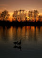
Love birdsby SoulMan1978Comment: Critique Club Comment
Well you hit the challenge right on - not only do you have the reflection of the trees, but you also have the reflection of the birds. I think that the dual reflections help bring out the theme of the challenge in the photo. The bird reflections alone might not have been enough - yes it would have met the challenge, but wouldn't have been as obvious to a lot of voters, I think.
Composition is very, very nice. The lines of the trees (and tree reflections) and the place where the birds are roughly follow the rule of thirds in a way that is very pleasing to my eye.
The one thing that I think throws me off, just a bit, is the color. I do love the orange, but I feel that the water is a bit too gray and for me, that clashes with the orange. Unfortunately, I don't have a good suggestion for you as to what I might like more.. and really, this is a relatively minor point when faced with the other strong points the image has. |
| Photographer found comment helpful. |
| 02/22/2008 08:46:21 PM |
Faces in the Windby SDWComment: Beautiful indeed. If I could give suggestions? The border is a bit much, for me - either just the white or just the black would do fine. Contrast could be a little bit increased, although it is not bad as it is - maybe this could help give it a bit more depth.
In any case, it is lovely and makes me think peaceful thoughts :-) |
| Photographer found comment helpful. |
Home -
Challenges -
Community -
League -
Photos -
Cameras -
Lenses -
Learn -
Help -
Terms of Use -
Privacy -
Top ^
DPChallenge, and website content and design, Copyright © 2001-2025 Challenging Technologies, LLC.
All digital photo copyrights belong to the photographers and may not be used without permission.
Current Server Time: 04/22/2025 07:45:55 PM EDT.