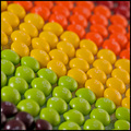
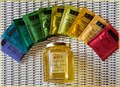
Taste The Rainbowby
BHusemanComment: Critique Club Comment:
Good things:
I like the border. Sometimes borders like that can be a little overpowering but yours does a good job of keeping the colors all nicely tied together.
I like how the Skittles are nicely arranged. You did a good job with lining them up - sometimes even a little bit of mistake here can really throw off the balance and flow of the image.
So-So things:
I like the diagonal composition, but perhaps if you had flipped the image horizontally, it would have led the eye in a more "rainbow" type fashion.
Background - there is not too much of it showing, but where it does, it distracts (just a little) due to the texture.
I agree that you could have put more red and purple in but this doesn't really bother me at all.
Things that could really help the shot:
The colors here are very flat and dull. A levels or curves adjustment would have helped immensely, I think.
Title is maybe not the most original - it's okay, just that when there are other images in the challenge like yours, having such a common slogan just underscores the idea in the voters' minds that this is something we have seen before.
In general, good attention to detail in the setup, and with a bit more careful attention to post-processing this could have been much better I think!