| Image |
Comment |
| 05/18/2010 09:33:45 PM |
|
 Photographer found comment helpful. Photographer found comment helpful. |
| 05/18/2010 09:31:29 PM |
|
| Photographer found comment helpful. |
| 05/18/2010 09:29:57 PM |
|
| Photographer found comment helpful. |
| 05/18/2010 09:26:29 PM |
|
| Photographer found comment helpful. |
| 05/03/2009 07:35:13 PM |
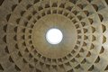
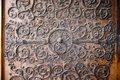
Pantheon ceiling detail, Romeby rhadshawComment: This photo has nice symmetries and you can really see the grooved features of the ceilings, which is interesting. I find the centre white spot a little too strong for my eyes and the shadows seem a bit strong on some of the tiles, especially to the right. It's too bad the rings end before the top - that might have helped with the imbalance that exists between the whiteness and the pattern.
In general, though, it's a nice example of circular and square patterns together. |
| Photographer found comment helpful. |
| 05/03/2009 07:29:28 PM |
Door detail, Notre Dame Cathedralby rhadshawComment: At a first glance, the white in the photo seems too strong to me. Perhaps the photo is lacking enough contrast in the left half? Also, I think a tighter crop might help - the blackness / shadows at the edges seem distracting. Since this is only a piece of the ornamentation, I assume, you could try cropping down and putting the door knocker along the upper line of thirds. It doesn't quite work for me when it's located straight in the middle.
I'm not sure about post-processing, but it would be nice to tone down some of the whiteness. If you've got enough pixels, maybe a really long horizontal crop along the face might bring out some interesting details in the face. |
| Photographer found comment helpful. |
| 05/03/2009 07:21:43 PM |
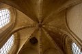
Ceiling detail, Quasimodo's chamber (aka Gift Shop), Notre Dame Cathedralby rhadshawComment: This photo is nice and sharp and has pleasing detail in the arches. The colours seem natural and warm and the windows don't distract from the centre, in my opinion. I'm assuming that if the windows weren't blown out, the arches would be too dark (unless you use HDR).
I wish it were fully symmetrical (I know that's not an option), but it would take this photo up a notch. I also find myself wondering if there were some way to do a square crop of the photo. The centrepiece, to me, almost seems to demand a square crop, but then it would change the nature of the picture, making it a bit abstract.
I got thinking about the crop, and I tried doing a crop to put the apex on the right (along the line of thirds). I think it makes the photo stronger. Your eye goes immediately to the apex, but then wanders to the 2 windows and back, giving you two points of visual interest. It also increases the symmetry, in an odd way. |
| Photographer found comment helpful. |
| 05/03/2009 07:03:56 PM |
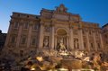
Trevi fountain at duskby rhadshawComment: I like the balance of colours that you've achieved here. The light is gorgeous - I'd love to know how you achieved the effect. I know what you mean about the tourists and in fact, you have precious few of them here, which is impressive all by itself. This sure is a major tourist trap. Unfortunately, it's a bit difficult to see the water, which is too bad because it's nice to get more of a "fountain" feel to the picture. Mind you, this is an enormous structure so it's difficult to get everything in from top to bottom.
I'm divided on the angle. Part me likes the angle of the photo because it gives some visual interest and a spark of life to the photo. Part of me would prefer that the fountain & building were level, I'm not sure why.
I really like the tones of blues mixed with the gold tones. |
| Photographer found comment helpful. |
| 03/09/2008 12:19:20 AM |
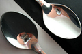
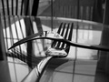
black or whiteby arati_halbeComment: I like the underlying idea, but it's way too distracting to see the camera in the photo. |
| Photographer found comment helpful. |
| 03/09/2008 12:18:51 AM |
Intimateby minjazComment: This is a good arrangement and lighting. I just wish there wasn't so much interference from the window lighting. My eyes are distracted by all the competing lines. |
| Photographer found comment helpful. |
Home -
Challenges -
Community -
League -
Photos -
Cameras -
Lenses -
Learn -
Help -
Terms of Use -
Privacy -
Top ^
DPChallenge, and website content and design, Copyright © 2001-2025 Challenging Technologies, LLC.
All digital photo copyrights belong to the photographers and may not be used without permission.
Current Server Time: 04/02/2025 07:23:38 PM EDT.