| Image |
Comment |
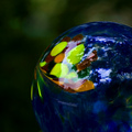
| 05/21/2008 05:24:55 PM |
Gazingby chesireComment: Nice complementary colours. I like the idea. No idea what it is, but reminds me of an Earth pictures made from space. |
 Photographer found comment helpful. Photographer found comment helpful. |
| 05/21/2008 05:20:02 PM |
Touched by the Sunby linnyComment: Greens lost their colour somehow, or maybe it was your choice to make the purple tulips to stand out more. BTW beautiful colour. |
| Photographer found comment helpful. |
| 05/21/2008 04:24:10 PM |
What's Up, Dock?by ShrinkComment: The picture looks a bit flat. Deeper depth of field could help give it more clarity. Or maybe it is contrast? You could go back and try it a bit later during a day, when the shadows are more intense and longer. |
| Photographer found comment helpful. |
| 05/21/2008 04:21:18 PM |
Illuminatedby EayeshComment: Dappled light is a bit subtle here (I guess you wanted to catch it on the surface of the water). The bridge is very dark. If you turned a bit to the left and made people a main subject it could help a lot. I like the colour of the water. |
| Photographer found comment helpful. |
| 05/21/2008 04:19:12 PM |
This Is My Bush!by maxxumgComment: The colours look a bit blown up. Also the lion is a bit soft. Maybe it was too early to catch nice, rich and warm colours of the lion. Evening light is far more flattering usually. I like cat expression. |
| Photographer found comment helpful. |
| 05/21/2008 04:12:23 PM |
Rest!by bspujariComment: I like the composition here and the limited colour scheme. I like they way you leave something for the viewer imagination. That makes a difference between a good photo or a postcard. I can see a bit of grain in the upper part of the image, but only under a certain angle so it may be my LCD. Very, very fresh idea. |
| Photographer found comment helpful. |
| 05/21/2008 04:10:16 PM |
Leaves, Mottledby colorcarnivalComment: Looks like a piece of graphic. The composition would be perfect for a textile :) I like B&W choice for this one. It's excellent technically. Very elegant. I wonder if yo had more smaller leaves in frame, as they look more interesting (making the composition more interesting I mean, than big flat areas of big leaves). |
| Photographer found comment helpful. |
| 05/21/2008 04:04:07 PM |
Emma in the Morningby NotroublesComment: I envy Emma :) It looks overexposed and a bit blurry. Looks like you focused on the leaves behind Emma, than herself. This picture has potential, however I would've tried different angle to avoid the children house, as it looks plastic and doesn't add to the picture. |
| Photographer found comment helpful. |
| 05/21/2008 03:54:51 PM |
Korakuenby noranekoComment: Looks a bit oersharpened and oversaturated, but it may be my LCD. The water looks like curtain. I like green reflections in the waterfall. |
| Photographer found comment helpful. |
| 05/21/2008 03:47:58 PM |
Under the Cedarsby pixelpigComment: I'm loosing some details here. The shadows are very soft, probably it's the cause. Interesting place. I would love to see it in colour. |
| Photographer found comment helpful. |
Home -
Challenges -
Community -
League -
Photos -
Cameras -
Lenses -
Learn -
Help -
Terms of Use -
Privacy -
Top ^
DPChallenge, and website content and design, Copyright © 2001-2025 Challenging Technologies, LLC.
All digital photo copyrights belong to the photographers and may not be used without permission.
Current Server Time: 04/19/2025 07:09:19 AM EDT.