| Image |
Comment |
| 04/04/2007 01:23:52 AM |
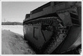
Retired militaryby ShutterPugComment: Positives:
Choice of B&W with grain works well with this image. Technicals generally good.
Technicals:
Grainy appearance comes across well. No seriously overexposed or underexposed areas. Perspective is OK, but not exceptionally strong. Lighting is hard to evaluate. Near side is in shadow but that seems to work well for this particular image. The bright 'thing' in the lower right corner is unidentifiable and acts as a distraction. The distant signage acts as a minor distraction drawing attention from the main subject.
The Challenge:
Meets the challenge well. BW is always a good choice for grain images. Even the subject, a military vehicle, fits a gain theme. DPCer need for a big "wow" factor played a roll in the score. You really didn't give the viewer a lot to attract attention to this image. Voters might have thought it boring. Since you can only do global changes the composition has to be stronger in basic challenges to carry the image.
Suggestions:
I'm curious how you got ISO 320, that seems like a very strange value. Perhaps using the fisheye lens to exaggerate the features on the vehicle might be tried to add more viewer interest to the composition. Definitely crop out that bright object in the lower right corner. |
 Photographer found comment helpful. Photographer found comment helpful. |
| 04/03/2007 11:43:05 AM |
Fueling upby oskarComment: Very creative and well done. Lighting is fine. You might consider a smaller crop to remove wasted space a little all the way around, but particularly on the left side. That will focus more attention on your main subject and provide them more room in the composition without losing anything significant from the background. |
| Photographer found comment helpful. |
| 04/02/2007 11:04:03 PM |
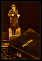
In The Beginning...by BlackboxComment: Soooo... the question is, "Which is the anachronism?" - The Bible, the keyboard, or - heaven forbid! - Albert E. |
| Photographer found comment helpful. |
| 04/01/2007 12:38:46 AM |
Into the Westby hihosilverComment: Best in the challenge! Colors good, nice cave wall silhouette framing. Placing what likely is an overexposed sun area behind the large rock is a nice touch. High technical quality. |
| Photographer found comment helpful. |
| 03/30/2007 02:55:03 PM |
Miguel-Street Artistby edmengComment: You don't need me to tell you this is a fine color portrait, you already know that. You are someone who knows what they are doing and does not need me to tell you what is good or what is not. I'd be torqued if this were my image and it scored so low.
Positives:
Strong technicals... focus, lighting, perspective and the use of the offset framing are all well applied. Sharpness is very good. You have applied good current photographic environmental portraiture technique that flatters your subject. I'm certain if you were doing this as a sitting for a client this would be well accepted, even by an artist and they are sensitive.
Technicals:
Decent overall technicals. Some might say the face is harsh and focus slightly oversharpened, etc. Personally, I think they would be wrong. There is little about your presentation that is unflattering to your subject. You've likely captured him well.
If anything the brightness is slightly below normal, but not much. Even with that it probably fits the image.
The challenge:
I'm sure there would be no end of voters who would suggest, "You got over 5.6, what more do you want?", as if 5.6 is a good score. It isn't. I don't care, I would not be satisfied by that score with this image if it were mine nor do I think you should be either.
Suggestions:
You could increase brightness and add vignetting to highlight the subject against the existing background but that is about all. This is a good image as it is. |
| Photographer found comment helpful. |
| 03/30/2007 01:54:17 PM |
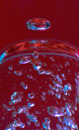
Odd One - "OUT"by joekentComment: Positives:
Abstracts are always difficult to interpret but the bubble at the top is this image's most attractive and distinctive feature.
Technicals:
Image appears excessively red. Depth of field and/or shutter speed contributed to the poor focus of the bottom bubbles.
The Challenge:
Your image scored below the DPC average. To be honest, setup played little role in that which is what bothered you most. Mostly it is likely that voters felt that the red in this image added little impact to the composition and/or or was added in post... either would be a killer in voting.
Most likely voters felt you added red in post processing to meet the challenge and voted you low because of that and its technicals.
Suggestions:
Shot at 1/250th sec af f/8. Think it might be more effective if the bottom were all totally focused and that would better support the overall effect of this image. You can only do that by either increasing shutter speed or depth of field. Either will require more light or higher ISO. You should ALWAYS favor more light over ISO to reduce noise effects. |
| Photographer found comment helpful. |
| 03/30/2007 01:28:04 PM |
Captivatedby Shadowi6Comment: Positives:
Beautiful blue eyes. Nice the way you covered part of the face with a book for added viewer interest. Selection of a Harry Potter book is cute.
Technicals:
Lighting generally OK but not exceptional. Color and overall exposure looks good. I suspect there are several technical features that negatively affected voters. Though the eyes themselves are very beautiful and immediately draw attention, the undereye area is harsh and viewers will vote you lower because of it. And that is partly because the eyes attract so much attention already.
Ironically, it also appears that noise reduction may have been overused to make the areas above the eye browse and on the nose and bridge of the nose oversmoothed because of it.
The challenge:
Obviously, this meets the challenge.
Suggestions:
This image is quite similar to another friend's entry in the same challenge that scored much higher. For that reason I suspect that technical quality figured prominently in your score.
Use the blur tool to soften and or eliminate the harsh undereye areas, even to the point of being unrealistic to your model, but realistic to viewers. That will make more difference than anything else.
Review post processing to insure that there is not the appearance of oversmoothing on your model's face.
Sharpening may be very slightly overdone so you may want to back off on it a bit. That is a lesson I've never quite learned myself. :)
Lastly, you have a basically blank background. Nothing wrong with that, but you might consider adding vignetting around the subject for added viewer interest. |
| Photographer found comment helpful. |
| 03/30/2007 01:00:09 PM |
A Very Special Cat: Siamese Kaomaneeby pla2Comment: Positives:
Pink color cast works well. Overall general image quality is good. Directing the viewer to the cat's eyes using shallow DOF is nice.
Technicals:
Lacks under/over exposed areas (You'd be how surprised how often high scoring images at DPC have them). Lighting, though not defective, does not add much viewer interest. Composition is OK. Image is a little soft perhaps by design but does not necessary add much to the composition.
The challenge:
As far as meeting the challenge is concerned, this meets it. This one is a little ununsual as challenges go but an unique and rare animal fits the bill.
There are a couple other things about it, though that would affect it in scoring. Domesticated animals typically don't do well in challenges. Post processing to add a color cast as appears in this case is sometimes voted lower.
Possibly... just possibly some voters thought that you adjusted the color of the cat's eyes to be different colors. Whether you did or did not does not matter, the image might appear to be doctored for effect by some voters and they will vote it lower as a result.
Suggestions:
You might consider backing off on the pink color casting to make it slightly more subtle. Post process this image for more dramatic highlighting of your main subject for greater impact. OR add lighting your main subject in ways to engage the viewer. Either would make a huge difference in score. Perhaps posing the animal in other perspectives would also add more viewer interest.
I suspect that you were counting on the unusual nature of your subject for it's impact. But if viewers think that the image is unusual because of post processing the truth does not matter... they will vote it lower anyway. Photography is a purely visual medium. |
| Photographer found comment helpful. |
| 03/28/2007 03:49:54 PM |
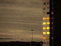
Windows at sunsetby flavioalimaComment: Positives:
In terms of being technically well done within the confines of the challenge topic, this works OK.
Technicals:
Lighting and general exposure and lighting seem good. Composition with offset and use of negative space is OK. Overall grain in this image is much better than in most others in the grain challenge.
The challenge:
Though the grain is well done it is not really necessary for this particular image within the confines of this challenge and that is a critical element.
I suspect the below average DPC score for this image results from two things... One, grain does not contribute significantly to the overall impact of the image and; two, it has little to attract viewer interest on a DPC level. It is just a building with attractive window lighting. DPCers want more "wow" factor in their images.
For the challenge perhaps there is to much grain or it is closer to the "digital noise" variety.
In the end perhaps subject matter played a greater role in this challenge in the acceptance of this image than anything else. Maybe you should have chosen a different subject for a higher impact and therefore a higher score.
Suggestions:
Technically speaking there is little to suggest. Changing subjects to add viewer interest might be in order. Grain generally works well for 'old' style photography and/or hard core inner city imagery. BW is more common than not for grain. |
| Photographer found comment helpful. |
| 03/28/2007 02:01:35 PM |
Thoughtfullby zaflaboutComment: Positives:
Use of a solid white BG and the rule of thirds works well. Model pose is all right.
Technicals:
Exposure generally OK but not outstanding. Composition is fine. Color looks OK to me on this monitor.
Lighting is weak and looks to be 'flat' overall.
Sharpness, or the appearance of sharpness, is curious in this particular image and, unfortunately, probably hurts it. There are some high contrast small overexposed 'spots' on the lips that appear oversharp, yet most of the rest of the image looks 'soft' focused. Some facial blemishes should probably be removed. That confuses the visual viewer.
It looks like you applied noise reduction and it showed up in some areas more than others. That gives the image an unbalanced sharpness quality that many viewers will notice and not like. It seems smooth and unfocused in some areas yet oversharpened in others.
The image looks a little 'flat' contrast-wise.
The Challenge:
Obviously it meets the challenge. But in a challenge like this viewers expect perfect technicals and/or a unique interpretation... they get neither in this image.
Suggestions:
Focus on the technicals. Work on the issue of sharpness. If you used noise reduction then increase or decrease width of sharpening to either allow the image to be sharper or softer overall. If softer, avoid making your model look 'plastic'. If sharper, don't oversharpen.
Increase contrast and/or brightness to give the image more viewer interest and impact. Add vignetting and or dodge and burn to highlight the model and or add more viwewer interest to the overall composition. |
| Photographer found comment helpful. |
Home -
Challenges -
Community -
League -
Photos -
Cameras -
Lenses -
Learn -
Help -
Terms of Use -
Privacy -
Top ^
DPChallenge, and website content and design, Copyright © 2001-2025 Challenging Technologies, LLC.
All digital photo copyrights belong to the photographers and may not be used without permission.
Current Server Time: 04/11/2025 06:23:58 PM EDT.