| Image |
Comment |
| 03/07/2007 11:00:02 PM |
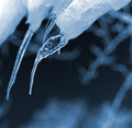
cool blueby PhotoDaveComment: Positives:
This is a nice image. It has an unusual and refreshing placement within the frame for the main sharp icicle. The soft focused icicles in the BG add interst to the composition. Choice of blue tones always work well for ice images.
Technicals:
It has above average technicals and tones. Sharpness is good but it can handle a lot more sharpening and would look even better. It is hard to describe but the other BG icicles almost look as though they have unrealistic haloing around them. It does not affect the rest of the image. That is probably due to your post processing.
Viewers may get distracted wondering what the elongated out-of-focus objects on the right side of the frame are and that draws attention away from the main icicle.
The challenge:
Meets the challenge well and is a classic icicle view. I suspect an overabundance of icicle images cause this one to be overlooked for a hihgher score. |
 Photographer found comment helpful. Photographer found comment helpful. |
| 03/07/2007 10:27:03 PM |
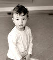
Playby mia67Comment: quote=mia67]  [/quote]
Positives:
Overall I really like this composition. You captured an interesting expression. The sharpness is exceptionally good and the technicals are generally very good. Your use of the rule of thirds works well and placement of the left eye on the intersection point is a nice touch. Sepia works very well with this image.
Technicals:
There are not lots of things wrong with this image. It is very well done. The only major flaw is that the left shoulder, arm and the child's back are overexposed. I checked with eyedropper to be sure it wasn't just my imagination.
The 'object' in the BG behind the left side of the child's head acts as a distraction.
The background has graininess but that really does not hurt the composition.
The challenge:
Submissions to free studies like "best of 2006" generally have exceptionally high quality images and yours got lost in that. Perhaps the overexposured areas were viewed as a major flaw by voters and disliked the BG distraction and that is why it was voted so low. |
| Photographer found comment helpful. |
| 03/07/2007 10:04:28 PM |
All the Possibilitiesby EducatedSavageComment: Positives:
Solid composition and an interesting selection for a photo study. The fine detail directly in front of the sphere is nice. The lighting setup is reasonably good.
Technicals:
This image has a commonly found flaw in DPC submissions - over exposure - which is ironic for a low-key challenge. The bright lighting in the sphere itself is completely washed out which is particularly disappointing given that it is in the main subject. You want your composition to have a full range of brightness up to pure white which you do, but you do not want to let it go overboard and lose detail. Unfortunately, you did.
Looking at the luminosity display and sampling points around the image it looks like you may have made some serious color manipulations as indicated that even in the 'black' areas there is a lot more red and green than blue. Normally you want the black areas to go all the way to 0,0,0.
There are a lot of tiny bright specks and distracting detail that draws attention away from the sphere. Sharpness is a little soft, but sharpening it more makes the bright specs even more distracting. It would be best to clean and smooth the sphere and re-compose and reshot it without the specs.
The challenge:
Technically speaking, a low-key image is one where there are more pixels on the left (dark) side of the luminosity display (histogram) than on the right. Except for the overexposed area in the sphere this meets that definition.
Low-key normally is a technique best suited for studies of lighting and tonality. Your selection has great promise for doing that but is a little weak in the technicals for bringing it out. |
| Photographer found comment helpful. |
| 03/07/2007 08:54:50 PM |
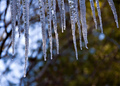
February in Vermontby bassboneComment: Positives:
Interesting perspective showing the icicles but not their base attachment. Though small it is nice you capture a drop falling. Composition works well.
Technicals:
Icicle soft focus is this image's greatest defect. The entire composition is directed to them so they should be as technically perfect as possible. Overall composition is weak.
Lighting is OK but not exceptional. Early morning and late afternoon are the best times for outdoor phototography because that is when there is the most interesting lighting and shadow. The icicle composition would benefit from that type of lighting. Background softness and content is OK but not very interesting.
The blue spot in the BG just below one of the icicles competes with it for attention so therefore acts as a distraction.
Looks like the image is not 'level' and tilted several degrees off vertical, a problem I have a lot myself. :) If done intentionally then I'd recommend at least a 15 degree angle. The human eye normally wants things at lesser angles to be perfectly vertical.
The challenge:
Obviously this fits the challenge. There is a long tradition of icicles imagery at DPC. The highest scoring ones are techically perfect images most often with one of more drops of water as prominent elements of the composition. You may want to review some of those for yourself to see what makes them 'good'. Message edited by author 2007-03-07 20:58:45. |
| Photographer found comment helpful. |
| 03/07/2007 08:11:26 PM |
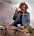
Hesitant Winter Riderby neophyteComment: Positives:
Balance of image, both tonal and compositional, with the police car and biker, go together well and BW is a good choice for presentation. High contrast works given the implied tension between 'RAT' and the police. Unsure if the maltese crosses were setup for the image, but support the composition.
Technicals:
BW is generally done well. Overall, focus and composition are OK... not exceptional. Perspective from behind the biker is fine but is taken from a snapshot angle. Compositional balance would further benefit from another element, like a pedestrian eyeing the biker's intent from the curb on the left side of the frame. Images with snow are always hard because of brightness and loss of detail as is true in your case.
The challenge:
Meets the challenge well particular with the biker car interaction.
|
| Photographer found comment helpful. |
| 02/26/2007 02:22:11 PM |
|
| Photographer found comment helpful. |
| 02/14/2007 11:22:38 AM |
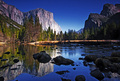
Preserving parks for future generations (Yosemite) by bryanbrazilComment: Congrats on the blue. Beautiful landscape. It has haloing around the right side mountains but otherwise a gorgeous composition. The western drought must be a lot worse than I thought. That looks more like late summer than winter. I always thought Yosemite was snowbound in winter. Global warming is taking it's toll. :) |
| Photographer found comment helpful. |
| 02/13/2007 03:35:50 PM |
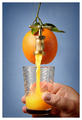
Freshly Tapped by TelehubbieComment: Great concept, beautiful processing. Color, composition, lighting and the vignetting are perfect. Top notch image despite the spiggot is off level compared to the rest of the image. |
| Photographer found comment helpful. |
| 02/13/2007 03:26:21 PM |
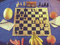
Grapefruit vs squashby whiterookComment: Interesting concept but low contrast and severe color noise hurts this image.
If it is white's move the bananas are recommending the grapefruit move G3 to G4 to put pressure on the black queen and open things up for a ferocious king side attack against black. That will make for an exciting game. The squash's bishop and queen side rook are no longer well positioned to protect the black king and allows white to develop the attack. |
| Photographer found comment helpful. |
| 02/13/2007 02:11:22 PM |
Red Hot Chili Peppersby ShannonLeeComment: Except for the residual color left between the orangish and red pepers this is a nicely done desat image.
Looks like the width of your border is uneven between the right and left sides.(I'm not talking about the top and bottom borders having a different width than the left and right sides) Don't know if you used Photoshop for this but you always want to enter only even numbers for the border width. Entering an odd number results in one side being a pixel wider than the other. |
| Photographer found comment helpful. |
Home -
Challenges -
Community -
League -
Photos -
Cameras -
Lenses -
Learn -
Help -
Terms of Use -
Privacy -
Top ^
DPChallenge, and website content and design, Copyright © 2001-2025 Challenging Technologies, LLC.
All digital photo copyrights belong to the photographers and may not be used without permission.
Current Server Time: 04/21/2025 06:24:15 AM EDT.