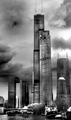
DPChallenge: A Digital Photography Contest You are not logged in. (log in or register
 
Browse Settings
Currently viewing:
Registered UserArtifacts

Show comments:

Per page:

Order:

Comments:


Comments Made by Artifacts
Pages:   ... ... [260]
Showing 71 - 80 of ~2598
Image Comment
Sky whisper to Earth
05/04/2007 11:19:59 AM
Sky whisper to Earth
by Kliopatra

Comment:
Welcome to DPC! Hope you have a great time and learn a lot.

Positives:
The reflection of clouds and grasses in the calm water surrounded by lily pads is the the best part of this image. Showing the expanse of lily pads is good as well.

Technicals:
Generally speaking the technical quality of this image needs work. On a sharpness sensitive LCD monitor it is slightly over sharpened and shows some "jaggies" along the edges of the blades of grass but no haloing.

It is taken from a "snapshot" perspective, the green color is weak and the image lacks a central theme and a specific object for the viewer to look at and focus on. It leaves the viewer asking, "What else is there?". Your image is like a nice background without a subject.

The Challenge:
This particular landscape challenge operated under expert rules and because of that voters had a higher level of expectation for technical quality than other challenges and that hurt your image in scoring. Yours is also not a classic landscape vista and some voters probably faulted you for that as well.

You scored 5.1 which is about .6 below the average score given for the challenge. That means voters felt it was below average. I agreed and gave your image a 6 which to me means below average but not a complete falure. I tend to score higher than the group, that is all. I agree with the group assessment.

Suggestions:
There is lots you can do to improve this image but will probably require reshooting. The main thing is perspective and composition. You might consider a much closer up picture to the grasses and lily pads taken from a shallower angle, say 15 degrees or less to the horizontal, maybe even show some sky. Then compose the picture such that one of the grasses and/or lily pads become dominent objects in the composition and serve to attract more viewer attention. Be sure to retain the nice refections you have in your submission. Darkening the greens may be more pleasing and attractive to the eye and adding some dodge and burn to give it more depth and adding a subtle darkening vignette around the whole composition might look nice.

You might want to study some of the top finishing images in challenges to get an idea what viewers like. If you live in Giza where this picture was taken then I'm sure you can find a lot of great landscape subjects to photograph.

Good luck and have fun!
Photographer found comment helpful.
Swirled in Stone
05/04/2007 12:38:24 AM
Swirled in Stone
by rjkstesch

Comment:
Great job!!!!
Photographer found comment helpful.
Dark Day
05/03/2007 09:14:42 PM
Dark Day
by qmdi

Comment:
The top right edge of the tall building has a slightly distracting halo but otherwise and incredible capture. Great job.
Photographer found comment helpful.
The Eye of God
05/03/2007 09:10:54 PM
The Eye of God
by DrAchoo

Comment:
Another very fine Antelope Canyon composition. Should do well. This canyon always does.
Photographer found comment helpful.
Riding The Wave
05/03/2007 09:08:58 PM
Riding The Wave
by yakatme

Comment:
One of the great landscape photo ops of the world. I suspect your polarizer was as much responsible for the deep blue sky as post processing. Nicely composed.
Photographer found comment helpful.
Satin in Stone
05/03/2007 09:05:33 PM
Satin in Stone
by rjkstesch

Comment:
Very nice Antelope composition. Well processed
Photographer found comment helpful.
Red Rock
05/03/2007 08:57:51 PM
Red Rock
by LuDeLush

Comment:
Nice Sedona view.
Photographer found comment helpful.
The Big Bang
05/03/2007 03:10:40 PM
The Big Bang2nd Place
by DUCATISTA

Comment:
Concept and composition combined with lighting and sharpness are the secrets to the success of this image. Great job and welcome to DPC!
Photographer found comment helpful.
Kaleidoscope Tower
05/02/2007 02:44:17 PM
Kaleidoscope Tower
by hihosilver

Comment:
Positives:
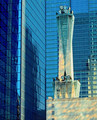
Sterling technical quality, including the blue color cast, is the strength of this image. Would make a good stock picture for telecommunications. The mottled lighting on the ATT building and reflections off the buildings add nice viewer interest to the composition.

Technicals:
Overall technical quality is top notch, particularly given this is done under basic rules. Sharpness is perfect, color processing excellent, framing left to right, top to bottom is just right.

Telecommunications tower MAY be titled slightly counterclockwise to the vertical, but is probably unnoticeable to most viewers.

The Challenge:
Nicely meets the challenge topic, particularly since the lighting on the tower differs from the rest of the image and better highlights its rule of thirds positioning.

At 5.87 it scored about .3 above the challenge average and almost .5 above the DPC average score given to all images in all challenges. That means voters think this image is above average but nothing special.

I scored this image a 10 and would do it again any day of the week and twice on Sundays. The reason is simple, when looking at an image like this the last question I always ask is, "Is there anything wrong with this picture?" If the answer to that question is "No" or a resounding "No" as it is for this image then it gets a "10" from me. "10" means "good" and this is certainly a "good" image. It has no significant faults and is very well post processed.

Suggestions:
No suggestions except perhaps a slight clockwise rotation of the ATT tower.

---------------------------------------------------------------------
Editorial: Leveling the Horizon
Looking at this image raises the question just what leveling the horizon really means. Perception combined with reality are your best guides. Obviously there is no actual horizon to level here and camera angle and lenses used both play a huge roll in perception of leveling.

Looking at this image we can see that on the left side the "vertical" lines tilt inward and on the the right side they tilt inward to. That is impossible and due to distortion introduced by the lens.

So what to do? In advanced rules you can correct for the lens distortion, but in basic you can't. In this case you have to make a decision based on the individual image and how it looks when you try. Given the challenge topic and main subject then making the telecommunications tower vertical is worth considering. That will mean a slight clockwise rotation to make the tower "striaght".

Overall it will matter little with this particular image but worth keeping in mind for the future.

End Editorial
---------------------------------------------------------------------
Photographer found comment helpful.
midday at the museum
05/02/2007 01:55:55 PM
midday at the museum
by ErinM

Comment:
Positives:
Well concieved and simple idea. In photography, simple and clean is GOOD! Framing with the window as the main background feature works well for the silhoutte. Technicals are good.

Technicals:
Sharpness is good, composition and framing to the rule of thirds to highlight your main silhouetted subjects are good. Including the kinetic art for balance on the left side is a nice touch and easily helps the viewer to know where the image was taken.

Edge framing is a little "ragged". The closeness of your subjects makes them hard to distinguish.

The Challenge:
Voters expect and demand only the highest quality images with significant "wow" factor in Free Study challenges to give an above average score. Yours lacks the "wow" factor voters were looking for and that is why it got a below average score from those given in that challenge, though it pretty much matches the overall DPC average score given. In others words, voters think it is an average picture.

Suggestions:
Though the framing is generally good the left edge is a little unevenly balanced against the right edge. You might consider cropping out just a little off the left side to achieve better balance with the right side.

If you could reshoot you might consider having your models stand further apart so their silhouettes are distinct and recognizable as separate individuals.

Probably the most significant thing to try to increase viewer interest and add "wow" factor is to better highlight the light rays emerging from the lower stairwell on either side of the frame. That lighting is a significant feature of the composition that is begging to be brought out more. Dodge and burn and/or specialized color post processing could be used to good effect to draw attention to that lighting and get a higher score.
Photographer found comment helpful.
Pages:   ... ... [260]
Showing 71 - 80 of ~2598


Home - Challenges - Community - League - Photos - Cameras - Lenses - Learn - Help - Terms of Use - Privacy - Top ^
DPChallenge, and website content and design, Copyright © 2001-2025 Challenging Technologies, LLC.
All digital photo copyrights belong to the photographers and may not be used without permission.
Current Server Time: 04/05/2025 03:54:34 PM EDT.