| Image |
Comment |
| 05/13/2011 01:44:40 AM |
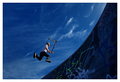
Astronautby QikiComment: Great! Specially when looking at the thumbnail it really creates impression of someone above the earth. You should paint some stars on the wall :) |
 Photographer found comment helpful. Photographer found comment helpful. |
| 05/13/2011 01:36:06 AM |
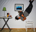
causually readingby creativethoughtsComment: Great idea and executed pretty well. Perhaps due to basic editing or some other constraints you left visible few artifacts here and there, but that aside, composition is good, diagonal you make is great. Hope to see some time more clean version - and don't cut yourself :) |
| Photographer found comment helpful. |
| 05/11/2011 03:32:47 PM |
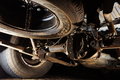
Not in the Nissan Brochureby PsquaredComment: Definitely unusual point of view for someone not in car repair business, but the image is complex - there are many elements that visually compete for attention - there is no significant focus point, and it is not an image that can be in category with no focus point at all. Hard to say - perhaps different lighting can help - if you light one part well and other areas will be dark, but supporting that main part. |
| Photographer found comment helpful. |
| 05/11/2011 03:02:01 PM |
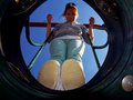
Superheroby scottbrooksComment: Excellent composition! Very original shot! Despite the fact that hand is blurry and even face is not exactly sharp, it is "constructed" so well sharpness becomes only a minor point. Some may say blurriness adds feel of motion. Perhaps :) |
| Photographer found comment helpful. |
| 05/11/2011 02:42:00 PM |
Chek me outby ankursomaniComment: I wish her eyes were more visible above the glasses making it really interesting point of view. Current composition I feel is not that strong. Bar above I think can be cropped a bit (or more :) - it is obvious that she is below it, but space it takes in the image is much more than needed and rather distracts. |
| Photographer found comment helpful. |
| 05/11/2011 02:34:48 PM |
The "Swinger"by mundilitliComment: Good composition and among the best by originality in this challenge. Light is challenging, but you managed exposure well. It is unfortunate from my point of view that her shoes are white - that somewhat competes with main focus of the image that I think is her face and figure. Good work anyway. |
| Photographer found comment helpful. |
| 09/11/2010 08:51:18 PM |
metal, glass,stoneby tgbookloverComment: Nicely seen - good work. I think basic editing allows to use curves adjustment layer and probably it is possible to make different triangles more prominent here. Monochrome seems like right choice for the subject, but bluish color I feel is not the best choice. Hard to say though :) |
| Photographer found comment helpful. |
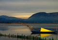
| 09/11/2010 08:30:02 PM |
Triangular Sailby andpolitisComment: I consider this one of the most successful in the challenge - nicey done. I see few triangles including one that is brightest part of the sky framed by the mountains below and darker sky above. However, have suggestions. Stick on right end of the boat distracts. I tried cropping and feel this image will rather gain if cropped from right about 30 pixels. It will cut boat, but looks fine to me. Then cropping half of the sky. This will concentrate attention to your main point of interest - sail and boat, but also will create diagonal with the sky triangle I mentioned. For the future - if at all possible to position camera higher, it would make water as a background for these poles with fishing net - right now they "contact" the other side of the bay with similar color. But, ... consider all above just compliments to very good work :) Hope to see this very high in results. |
| Photographer found comment helpful. |
| 05/23/2010 04:32:05 PM |
Fragile Beautyby JPRComment: Very nice image - I like soft palette and gradual change of color from green on the bottom to whatever on the top. Agree this thin/tenuous grass (not sure - is it because there are only few of them, or "contrasting" their structure to blurry backgound, or whatever else) creates impression of fragility. Thinking what can make this image stronger, I think cropping right part (quarter or up to third of the image) can help focus only on these 2-3 stems, will make lines closer to be diagonal and create more dynamic to the image. There still be enough bokeh in the image if that is a concern :) Good work! |
| Photographer found comment helpful. |
| 05/23/2010 04:32:00 PM |
jewelby ursulaComment: I don't know what is this and how is this produced. And I don't really care! Because this is beautiful! |
| Photographer found comment helpful. |
Home -
Challenges -
Community -
League -
Photos -
Cameras -
Lenses -
Learn -
Help -
Terms of Use -
Privacy -
Top ^
DPChallenge, and website content and design, Copyright © 2001-2025 Challenging Technologies, LLC.
All digital photo copyrights belong to the photographers and may not be used without permission.
Current Server Time: 04/02/2025 06:09:01 PM EDT.