| Image |
Comment |
| 10/07/2006 10:21:09 AM |
Lost InThoughtby FirstyComment: I like the use of black/white here. I think the lighting is a bit too harsh on her face. I would also crop the lower part of this photo, as I find the polka-dots to be too distracting. |
 Photographer found comment helpful. Photographer found comment helpful. |
| 10/07/2006 10:18:05 AM |
Sheltered from the stormby geewhyComment: Nice work with the composition and cropping. I like how the water is streaming down the window and the use of negative space. Wish he was wearing something darker as the white detracts a bit from the mood. I think I would desaturate this, too. |
| Photographer found comment helpful. |
| 10/07/2006 10:15:18 AM |
Harvest Homeby skewsmeComment: I like the duotones used to create the mood. I think the foreground is a bit too bright, and I might have cropped out the lower part just below the scarecrow, because I think it would draw the eye more to the building in the background. Good composition. |
| Photographer found comment helpful. |
| 10/07/2006 10:10:23 AM |
The Garden Isleby BalkoComment: The landscape has a lot of visual interest because of the variations of green color and texture. Well done! |
| Photographer found comment helpful. |
| 10/07/2006 10:05:26 AM |
I see youby ShamanComment: Nice macro. I really like how the proboscis (sucking mouthpart!) shows up so well. I think that this could be improved if you changed the DOF a bit to allow the antennae to be more in focus. |
| Photographer found comment helpful. |
| 10/07/2006 10:00:25 AM |
Hiding Placeby SlohandsComment: I like how the sunlight is streaming down to the water. I think this could be emphasized more by darkening the left half of the photo. |
| Photographer found comment helpful. |
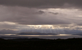
| 10/07/2006 09:58:21 AM |
After the Stormby barbaraanneComment: I really like the muted colors of this composition. Very cool how the sunlight is streaming through the clouds in the distance. Don't know that I would change anything! |
| Photographer found comment helpful. |
| 10/07/2006 09:56:25 AM |
Portmarnock - Irelandby slo007Comment: Composition and colors are good. I also like the shadow cast on the sphere. I think I might have cloned out the small area of land in the distant horizon. |
| Photographer found comment helpful. |
| 10/07/2006 09:53:49 AM |
|
| Photographer found comment helpful. |
| 10/07/2006 09:52:03 AM |
Kept Sadnessby arjunasComment: I think the eye is the focus here. The top 1/3 or more should be cropped to emphasize that. Also, this needs more contrast to increase the texture of the skin. The picture size is also too small for this challenge. |
| Photographer found comment helpful. |
Home -
Challenges -
Community -
League -
Photos -
Cameras -
Lenses -
Learn -
Help -
Terms of Use -
Privacy -
Top ^
DPChallenge, and website content and design, Copyright © 2001-2025 Challenging Technologies, LLC.
All digital photo copyrights belong to the photographers and may not be used without permission.
Current Server Time: 04/24/2025 06:06:48 PM EDT.