| Image |
Comment |
| 09/09/2008 01:11:48 AM |
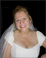
The Brideby bobonacusComment: Violinist really knows his PP stuff! My only comment is that the on board flash straight in her face is really unflattering, but what choice do you have when it's the only light available? A speedlight is essential for me at weddings. |
 Photographer found comment helpful. Photographer found comment helpful. |
| 09/09/2008 01:08:26 AM |
Darrylby bobonacusComment: Good job on bringing out the detail. I'm sure there would be a way of doing this without losing colour in the face (as Kelli pointed out), but I don't know what it is! |
| Photographer found comment helpful. |
| 09/09/2008 01:05:59 AM |
Nathanby bobonacusComment: The face is much better after the edit! The cloning on the background is a little rough, but great in principle. |
| Photographer found comment helpful. |
| 09/09/2008 01:03:54 AM |
|
| Photographer found comment helpful. |
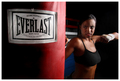
| 09/08/2008 07:42:26 AM |
Everlast - Boxing Bagsby JaimeVinasComment: This image is perfect for an advertisement, very well done. I don't think it would work for a catalog though, as the product is not depicted in its entirety. |
| Photographer found comment helpful. |
| 09/08/2008 07:39:57 AM |
|
| Photographer found comment helpful. |
| 09/08/2008 07:38:11 AM |
|
| Photographer found comment helpful. |
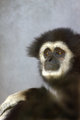
| 09/08/2008 05:38:57 AM |
Mikeby KelliComment: Yes, it is very funny how much it looks like a person portrait! Put a cigarette in his hand and might look a bit like  Violinist123 Violinist123's first one!
I find the graininess a bit much in this one, and the smear in the bottom right corner is quite distracting, but his eyes are wonderful. Did you try any noise reduction software? |
| Photographer found comment helpful. |
| 09/08/2008 05:35:18 AM |
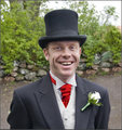
Nathanby bobonacusComment: This is a much better angle for the hat - it doesn't cast as much of a shadow on the eyes.
I find the background a bit distracting, although I don't think you could have placed it much better - cutting just above the shoulders I think was the best choice. |
| Photographer found comment helpful. |
| 09/08/2008 05:33:13 AM |
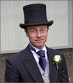
Darrylby bobonacusComment: He looks so happy!
I find the overexposed vest/underexposed eyes a bit much. Maybe some selective brightness/contrast or dodging/burning might have made the image more pleasing? |
| Photographer found comment helpful. |
Home -
Challenges -
Community -
League -
Photos -
Cameras -
Lenses -
Learn -
Help -
Terms of Use -
Privacy -
Top ^
DPChallenge, and website content and design, Copyright © 2001-2025 Challenging Technologies, LLC.
All digital photo copyrights belong to the photographers and may not be used without permission.
Current Server Time: 04/21/2025 10:10:59 PM EDT.