| Image |
Comment |
| 12/03/2006 12:54:45 AM |
|
 Photographer found comment helpful. Photographer found comment helpful. |
| 12/03/2006 12:53:55 AM |
|
| Photographer found comment helpful. |
| 12/03/2006 12:52:31 AM |
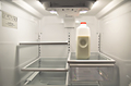
Got Food?by Jason_CrossComment: looks like my fridge except this one is cleaner. A downward angle might have helped rid the top of the fridge and a bit more crop on the left to get rid of the sticker. A little light from behind the camera might have helped with that shadow on the left too. That isn't particularly distracting though. Love the title. 6 |
| Photographer found comment helpful. |
| 12/03/2006 12:46:26 AM |
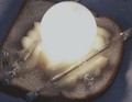
Pale Aleby KelliComment: This is either too overexposed or you increase brightness without compensating in contrast. Its too washed out. The idea is good and the composition is nice. I'd like to see the original when the challenge is over. |
| Photographer found comment helpful. |
| 12/03/2006 12:38:45 AM |
Flush and forgetby permapierComment: interesting. Gross but interesting. I like the way the shape of the toilet, the shadow and the waterline compliment the shape of the mask. |
| Photographer found comment helpful. |
| 12/03/2006 12:36:24 AM |
|
| Photographer found comment helpful. |
| 12/03/2006 12:33:47 AM |
White on Whiteby ernstlindeComment: maybe its just a textured wall but this looks pretty noisy to me and sort dark in a challenge that is generally pretty bright. I see you have white on white but your whites are not white. |
| Photographer found comment helpful. |
| 12/03/2006 12:18:18 AM |
Indiscriminant Shadowsby SherwinJamesComment: Oh I like that this makes a statement. Very cool!! The photo has good comp and exposure. The more I look at it though makes me think. The yellow tack's shadow is still slightly yellow too but only at the part close to the tack. The further away from the tack the shadows all look the same. Very cool! |
| Photographer found comment helpful. |
| 12/02/2006 11:59:50 PM |
Lovers For Lifeby jrjrComment: Nice looks familiar.... I guess you can't go wrong with similiar entry in a similar challenge right? It is done nicely though. 8 |
| Photographer found comment helpful. |
| 12/02/2006 11:54:07 PM |
Rivetedby pointandshootComment: The red spot on the right side could probably have been cloned out since this is advanced editing. It is sort of distracting from an otherwise very cool photo. 8 |
| Photographer found comment helpful. |
Home -
Challenges -
Community -
League -
Photos -
Cameras -
Lenses -
Learn -
Help -
Terms of Use -
Privacy -
Top ^
DPChallenge, and website content and design, Copyright © 2001-2025 Challenging Technologies, LLC.
All digital photo copyrights belong to the photographers and may not be used without permission.
Current Server Time: 04/19/2025 05:10:29 AM EDT.