| Image |
Comment |
| 05/31/2004 12:47:11 AM |
|
 Photographer found comment helpful. Photographer found comment helpful. |
| 05/31/2004 12:45:10 AM |
Curious Cowsby e301Comment: Congrats for doing so well with this shot. It was one of my favorites. I was happy to see you were the photographer. :D |
| Photographer found comment helpful. |
| 05/30/2004 11:37:56 PM |
|
| Photographer found comment helpful. |
| 05/30/2004 11:37:26 PM |
I see dead peopleby jzossComment: I don't think the double exposure effect is helping this image. There really isn't a strong visual connection between the snap shot of the woman and the bars and lights in the background. It looks like a film advance error. Sorry. |
| Photographer found comment helpful. |
| 05/30/2004 11:32:28 PM |
|
| Photographer found comment helpful. |
| 05/30/2004 11:31:04 PM |
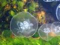
JellyFishby ytugcuComment: This shot is not as sharp as a subject like this requires. The colors are rather faded. There seems to be a reflection or glare in the right top corner. I suggest more careful cropping of the main subject. The jelly fish that are coming out of the edges of the frame draw focus from the central subject. |
| Photographer found comment helpful. |
| 05/30/2004 11:28:45 PM |
Casino Colorsby tfarrell23Comment: I found this composition to confusing and cluttered to make much sense of it. I'm sorry. |
| Photographer found comment helpful. |
| 05/30/2004 11:27:58 PM |
Red Rope Licorice...by jmleliiComment: I like the model's pose and the overall composition. I don't care for the background which looks rather like a mattress cover. I don't care for the harsh lighting. The shadow behind her detracts as does the very bright spot behind her elbow. |
| Photographer found comment helpful. |
| 05/30/2004 11:23:54 PM |
LoveLightsby soheilComment: This is a little bit overlit in my opinion. There is very little detail in the shadow and highlight areas of the doll. There is good separation between the subject in the background although it is a bit two-dimensional. As a subject, I don't find this doll too compelling (she is a little creepy looking to me)Other's might though. Good luck! |
| Photographer found comment helpful. |
| 05/30/2004 09:05:57 PM |
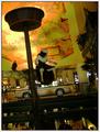
The Flag in the 'Old Arcade'by bobdaveantComment: This is actually quite a good interior, architectural shot. I would ignore the ones, twos, and threes---wierdness. Your subject is quite obviously centered so there is no real exuse for giving this photo less than a five. I probably would have scored it higher than five personally. I didn't vote on all the centered challenges and didn't see this one.
|
| Photographer found comment helpful. |
Home -
Challenges -
Community -
League -
Photos -
Cameras -
Lenses -
Learn -
Help -
Terms of Use -
Privacy -
Top ^
DPChallenge, and website content and design, Copyright © 2001-2025 Challenging Technologies, LLC.
All digital photo copyrights belong to the photographers and may not be used without permission.
Current Server Time: 04/23/2025 02:11:04 AM EDT.