| Image |
Comment |
| 05/19/2004 11:11:01 AM |
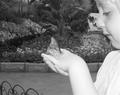
fly away with meby mamabear5612Comment: The child's skin tone is rather washed out (from flash, I suspect). I'm baffled by the choice of black and white for a butterfly garden. The background could have used a bit more blurring. The fence in the lower left corner is distracting. The composition is really nice (with a teeny bit more cropping of the left side of the frame). I gave it a 5. |
 Photographer found comment helpful. Photographer found comment helpful. |
| 05/19/2004 11:04:51 AM |
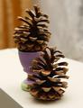
Untitledby oksamitComment: This is horizontally centered but not dead center. To my eye, dead center is about where the green dot on the egg cup is---not the main visual element of this photo. The focus is excellent. That dark corner of tablecloth is pretty distracting. Nice blurred background. The subject is kind of dull. |
| Photographer found comment helpful. |
| 05/19/2004 11:00:09 AM |
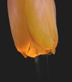
Very thirstyby camelotnorthComment: I'm not understanding the choice of placing the flower upside down in the frame. I think that is a blur of water underneath it but that's not clarifying anything. |
| Photographer found comment helpful. |
| 05/19/2004 10:58:41 AM |
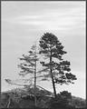
Embraceby LucidLotusComment: I'm thinking the darks could have more detail. There is almost too much contrast between the trees and the sky. The meter read for the sky, thus overexposure. I would only call this horizontally centered. The challenge guidelines specified dead center. Outside the challenge, I like your composition. I gave this a 5. |
| Photographer found comment helpful. |
| 05/19/2004 10:53:37 AM |
|
| Photographer found comment helpful. |
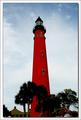
| 05/19/2004 10:52:09 AM |
Ponce de Leon Inlet Lighthouseby GallatinComment: I like the red and the blue. I also like the slightly blurred trees. I'm trying not to be a stickler about the guidelines of the challenge but they did say specifically, 'dead center' and this isn't. It is only horizontally centered. I gave it a five because of that. Otherwise I would give it a 6. |
| Photographer found comment helpful. |
| 05/19/2004 10:49:32 AM |
Hibiscus Center Centeredby JeileenComment: The stamen is centered, yes, but it isn' t really the main visual element of this photograph. I had a hard time seeing it against the background. The main visual element of this photo seems to be color. |
| Photographer found comment helpful. |
| 05/19/2004 10:47:02 AM |
Grandma's Crossby katlynComment: This shot is pretty fuzzy. I wouldn't call this dead center. I'm trying not to be a stickler but the main focus of the cross would be the cross bar. That is the element that should be dead center but you've placed it in the corner. |
| Photographer found comment helpful. |
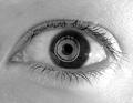
| 05/19/2004 10:45:07 AM |
center of the soulby fstopopenComment: That weird thing on the eye is disturbing but not in a good way. It's just creepy. Sometimes simple is best. Just the eye would have been fine. |
| Photographer found comment helpful. |
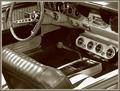
| 05/19/2004 10:43:03 AM |
A "Shift" Back to the Pastby tfarrell23Comment: This is a nice shot in terms of sharpness. You've got the gear shift pretty dead center (I'm not measuring). But I don't know....it's a car interior and the main focus is the gear shift? The sepia tone was a good choice in terms of helping to tone down the visual clutter. |
| Photographer found comment helpful. |
Home -
Challenges -
Community -
League -
Photos -
Cameras -
Lenses -
Learn -
Help -
Terms of Use -
Privacy -
Top ^
DPChallenge, and website content and design, Copyright © 2001-2025 Challenging Technologies, LLC.
All digital photo copyrights belong to the photographers and may not be used without permission.
Current Server Time: 04/22/2025 12:18:31 PM EDT.