| Image |
Comment |
| 03/24/2006 12:12:56 AM |
|
 Photographer found comment helpful. Photographer found comment helpful. |
| 03/21/2006 03:25:09 PM |
Hellby abuckComment: Greetings from the Critique Club...
Hi abuck :)
Your idea here is a good one for this challenge, but I think the execution of it probably cost you quite a bit. I'm not sure how to suggest improving it because I have never tried anything like it myself. I think the color of the fire is a bit weak and it could possibly be stronger with a faster shutter speed making that sharper as well. A little more detail in the background subject would probably bet nice as well :)
|
| Photographer found comment helpful. |
| 03/21/2006 03:12:29 PM |
[ WELCOME STRANGER ]by gocComment: Greetings from the Critique Club...
Hi gooc :)
If you request a critique from the critique club, you should always fill out your 'Photographer's Comments' field when you submit your photo. When you don't include your own thoughts on the image, you can't really expect someone else to give their time and effort to give you a critique. It makes me think that you don't care enough about your own photo to take the time to post your thoughts on it...
I like this image quite a bit. It has a very interesting surreal mood, which adds significantly to the theme of this challenge. In the afterlife, things may seem unique, obscure, and dreamy in general. I like to think of it that way. This photo scored over 6 so the general population liked it as well. I read through your comments and the negative ones seem to be on items that would make it less surreal if they were implemented. Take those with a grain of salt :)
John Setzler
|
| Photographer found comment helpful. |
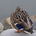
| 03/19/2006 10:04:50 PM |
Sleeping Duck - Quiet Pleaseby CantiqueComment: Greetings from the Critique Club...
Hi AC :)
There is nothing wrong with this photo... the technicals are fine and the composition is ok. The lighting feels a little flat but not too bad. I think the subject/composition just lack interest for me personally. Sometimes a photo has nothing really wrong with it and still doesn't draw much attention. This usually points to the subject choice and/or the composition of that subject. I can't really offer you much on this one other than that. The photo didn't score poorly but it didn't do particularly well either...
John Setzler
|
| Photographer found comment helpful. |
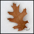
| 03/19/2006 11:52:37 AM |
At Rest in the Snowby JEFFJSBComment: Greetings from the Critique Club...
Hi JEFFJSB :)
This is a nice study in simplicity. The subject contrasts nicely with the environment and has a nice isolation as well. I can't really offer you a lot of critique beyond my general like for the image. I think it's very well done.
As I look at your camera settings, I ask myself a few quesitons though. Your +2/3 exposure compensation was a good start here for sure with the white background, but I'm struggling to understand the choice of f/14 @ 1/25" on the exposure. It seems like a smaller aperture would be in order since there is no depth to the image and depth of field would not be an issue. Shooting that same image at f/5.6 would have allowed a shutter speed up around 1/200" or so. You don't have any visible camera shake in this photo, but you could have at 1/25". Just some thoughts :)
John Setzler
|
| Photographer found comment helpful. |
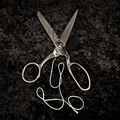
| 03/18/2006 06:11:02 PM |
Scissors and Threadby CarpeNoctemComment: Greetings from the Critique Club...
Hi CarpeNoctem :)
I always appreciate the study of classic photographers in one's own personal journey to improve. Ansel Adams was a definitive master of both the photography and printing process. I'm glad you have chosen him as a subject of study. You will learn quite a bit and delve into some subject matter that you may not have otherwise :) You will find inspiration in Edward Weston's works also.
This photo, as presented, doesn't seem to create much visual appeal. I think your background surface and perspective on the shot may be contributing to that. Depth is important, and this photo is rather two-dimensional. I don't think the viewer found much interest in the presentation...
John Setzler
|
| Photographer found comment helpful. |
| 03/18/2006 04:56:35 PM |
Softby shankswareComment: Greetings from the Critique Club...
Hi Shanksware :)
I think this photo is underrated for sure. It's a very nicely done portrait. The reason it is underrated is rather simple though. It's not your soft focus, technique, or composition. It's the subject. Your subject is indeed beautiful and, as I said before, it's very nicely executed. The problem is that the viewers of this image have no attachment to the subject and there is no particular wow factor that creates a link to the unattached viewer of the image. When presenting a portrait to a general public audience, you can't expect much in terms of artistic merit recognition.
My personal opinion of the image is that the color tones are possibly a bit too warm for the image.
John Setzler
|
| Photographer found comment helpful. |
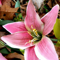
| 03/18/2006 12:59:19 AM |
Fake Flowerby rayg544Comment: Greetings from the Critique Club...
If you request a critique from the critique club, you should always fill out your 'Photographer's Comments' field when you submit your photo. When you don't include your own thoughts on the image, you can't really expect someone else to give their time and effort to give you a critique. It makes me think that you don't care enough about your own photo to take the time to post your thoughts on it...
This photo doesn't have much visual impact and the composition doesn't seem to have any particular consideration given to it at all. The background is quite busy and not complimentary of the subject either. The visual impact provided here is minimal and rather unimpressive. In my personal view, this photo is a very weak attempt... possibly a last minute idea. Better luck next time :)
John Setzler
|
| Photographer found comment helpful. |
| 03/17/2006 10:22:05 PM |
solitaryby TuckersmomComment: Greetings from the Critique Club...
Hi Tuckersmom :)
I like this image quite a bit. I think the back side view of flower blooms are way underrated :) This photo did well enough in the challenge that it doesn't really require any/much critique. My critique for you will be that you should always post your own thoughts and intentions in the photographer's comments along with your submission. Why did you submit and why do you like this photo? Giving your own insight to a photo is a form of self-critique that is very worthwhile. Your camera settings are also useful. Ask yourself why you chose those settings :)
John Setzler
|
| Photographer found comment helpful. |
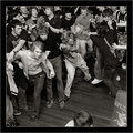
| 03/14/2006 04:06:48 PM |
Mosh Pitby BobsterLobsterComment: Greetings from the Critique Club...
Hi Bob :)
This photo did rather well in the context of the challenge and doesn't really require much critique. All I may be able to offer is my personal feelings on the image rather than a way to have it score higher...
The photo obviously meets the challenge and the voters seemed to like it. Compositionally, it feels a bit odd to me. It feels like a riot is taking place, and the partial person/object in the lower right seem to be the focal point, and there isn't enough context there to sort out what is happening. I'm not familiar with the term "Mosh Pit" so I couldn't use that to help me understand the image...
John Setzler
|
| Photographer found comment helpful. |
Home -
Challenges -
Community -
League -
Photos -
Cameras -
Lenses -
Learn -
Help -
Terms of Use -
Privacy -
Top ^
DPChallenge, and website content and design, Copyright © 2001-2025 Challenging Technologies, LLC.
All digital photo copyrights belong to the photographers and may not be used without permission.
Current Server Time: 04/19/2025 06:07:08 AM EDT.


![[ WELCOME STRANGER ]](https://images.dpchallenge.com/images_challenge/0-999/459/120/Copyrighted_Image_Reuse_Prohibited_303320.jpg)