| Image |
Comment |
| 08/02/2004 01:22:28 AM |
Potentialby JesuispeureComment: Great composition and lighting. Hard to imagine that at one point, all we needed was a desk that size. Love this as a duotone to give it a timeless feel. My only gripe? the odd border. Looks like you tried to give it a vignette-like edge but didn't feather enough. 7 |
 Photographer found comment helpful. Photographer found comment helpful. |
| 08/02/2004 01:18:13 AM |
You Are About to Witness A Crimeby ColeyComment: Very original! I really like this just based on how original it is. You always see re-enactments on TV from certain perspectives but never quite like this. If there was a way to mute the very bright spot on the kettle and onn the spot, I'd give this a 10. How about a 9 instead? Great job! |
| Photographer found comment helpful. |
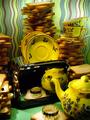
| 08/02/2004 01:11:52 AM |
Toasterby banmornComment: That's a lot of toast! I like toast but, man, that's a LOT. Love the background with its wavy lines. I do question the taste of toasted stoneware, however. :) Also, great job of hiding the photographer in the chrome surface of the toaster for the most part (I can still see you in the upper left corner). If that's not you then great job! 8 |
| Photographer found comment helpful. |
| 08/02/2004 01:09:15 AM |
Glassesby Hye5Comment: Making sure your glasses are very clean is so important in a shot like this. Excellent composition and symmetry. The lint/specks in the second glass are distracting. |
| Photographer found comment helpful. |
| 08/02/2004 01:07:49 AM |
Reflecting on Codes & Keysby Dr.ConfuserComment: Good attempt but there doesn't seem to be a single point of sharp focus. OK, maybe the lettering on the gray plastic card on the right but I doubt that is the main subject. Lighting is also very bright and harsh. |
| Photographer found comment helpful. |
| 08/02/2004 01:03:21 AM |
Primary Mergerby mcmurmaComment: Great use of DOF. I also really like the background as it lends nice touch of color to an otherwise colorless subject. Only thing I might have changed is maybe rotate the vessel a few degrees to the right so the bubble would not be visible. 8 |
| Photographer found comment helpful. |
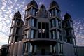
| 08/02/2004 12:57:46 AM |
Interesting Churchby pitsamanComment: This is definitely an interesting church however, I don't know if I'd consider it an everyday object unless you worked there. The tops of the church seem chopped off especially the second from the left. Photo seems a bit tilted to the right and it appears there is a bit of grain/noise throughout the image. |
| Photographer found comment helpful. |
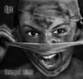
| 07/30/2004 03:15:17 PM |
DPC - Demerging Personality Conflict by kiwinessComment: This is another favorite of mine. Love the photo in b/w. It has very nice tonal range and contrast. The eyes Are a very strong focal point and they show lots of emotion. 10 |
| Photographer found comment helpful. |
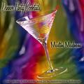
| 07/30/2004 03:12:27 PM |
Dinner Party Cocktailsby EddyGComment: Hands down my favorite of the bunch! Love the background and the typeface choices are perfect. I think that the glow you gave was a bit thick but perfect other than that. I give it a 9.5 but I need to round up to a 10 (too bad, huh?). :) |
| Photographer found comment helpful. |
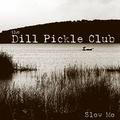
| 07/30/2004 02:42:54 PM |
the Dill Pickle Clubby jjbeguinComment: This group name sounds like a deli sandwich. Maybe it because it's almost lunch time. Hmm. Excellent and creative! My only issue is the sky. It has lots of compression artifacts or maybe it's just noise. Otherwise, great job! 9 |
| Photographer found comment helpful. |
Home -
Challenges -
Community -
League -
Photos -
Cameras -
Lenses -
Learn -
Help -
Terms of Use -
Privacy -
Top ^
DPChallenge, and website content and design, Copyright © 2001-2025 Challenging Technologies, LLC.
All digital photo copyrights belong to the photographers and may not be used without permission.
Current Server Time: 04/06/2025 02:57:41 PM EDT.