| Image |
Comment |
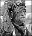
| 07/05/2004 01:59:02 PM |
Extraordinary Lifeby qmdiComment: This man seems to have had a long run of unfortunate luck. Seems he has collected trophies of slices of his life and put them on his head as reminders. Excellent tonal balance and contrast. Seems a little bit oversharpened. 8 |
 Photographer found comment helpful. Photographer found comment helpful. |
| 07/05/2004 01:13:12 PM |
Barsana Monasteryby smr78Comment: I like how the path leads the viewers' eyes to the buildings. Overall contrast is a bit on the bright side. 5.5 (because I would have preferred a closeup of one of the buildings instead) but I rounded up to a 6. |
| Photographer found comment helpful. |
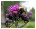
| 07/05/2004 01:07:17 PM |
On guardby mannenComment: Very nice macro study. And the "expression" of the bee's face is one of "back off." Sharp details of the bee and surrounding flowers. The only things I would have changed are the bright background in the upper right and remove the spider web but with a mean bee like that, I can understand why you didn't. :) Also the border is a bit thick. 7 |
| Photographer found comment helpful. |
| 07/05/2004 02:17:24 AM |
Temple of Public Transportationby redmoonComment: A very different perspective and it is original. I like the muted lighting but the long exposure also introduced a little bit of noise but it's not distracting. In fact, it adds to the feel of the image giving it a more industrial feel to it. I think the only thing I would change would be the cropping of the right side to eliminate the black spot or what appears to be a shoe. |
| Photographer found comment helpful. |
| 07/05/2004 02:07:43 AM |
"Above Us Only Sky"by basia03Comment: Very impressive landscape shot. Love the sepia/duotone. Perspective is also very good. The horizon (line where trees and mountain/land meet water) seems distorted and curved. Sky and clouds are very bright and appear oversharpened. |
| Photographer found comment helpful. |
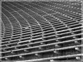
| 07/04/2004 03:04:04 AM |
So Many Uncomfortable Seatsby seanamiComment: Very nice image and use of curves and abstract symmetry (I made that term up). Contrast could use a little help to define the textures a little more. The really distracting point is that box near the middle of the photo. Real shame that is there to ruin such a great photo. Border is also a bit distracting as I really wanted my eyes to flow all the way to the frame constraints to enjoy the infinite feel you gave this photo. 7 |
| Photographer found comment helpful. |
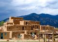
| 07/04/2004 02:59:54 AM |
Native American Puebloby SammieComment: This pueblo looks like a very good subject for photos that play with textures and light. But in this photo, it makes the pueblo appear more like a snapshot-style of photo vs one that could be more creative. Maybe try to narrow in on one specific part of the building like a window and door and give it some negative space. Let the natural light work for you. This was a beautiful day and it presented many opportunities. The wooden structure in the foreground is also distracting and blocks part of the pueblo. |
| Photographer found comment helpful. |
| 07/04/2004 02:54:55 AM |
The birth of a babyby ddmckinney1954Comment: This doesn't show the actual birth of the baby which is what I expect to see with this title. I see a newborn that is sleeping which is what they do very well. Focus seems to be sharper on the clothing and softer on the face. Maybe it's the lighting that makes it appear that way. |
| Photographer found comment helpful. |
| 07/04/2004 02:51:40 AM |
Rhythm Randall of Venice Beachby mirdonamyComment: Great focus and details of everything from the banner behind him to the textiles on the ground. Perspective is very good but maybe if it were taken a bit lower and maybe closer to eye level of the subject. Background is a bit bright but details are still present in the banner as I can see the fine wrinkles. Excellent shot overall! |
| Photographer found comment helpful. |
| 07/03/2004 06:24:22 PM |
|
| Photographer found comment helpful. |
Home -
Challenges -
Community -
League -
Photos -
Cameras -
Lenses -
Learn -
Help -
Terms of Use -
Privacy -
Top ^
DPChallenge, and website content and design, Copyright © 2001-2025 Challenging Technologies, LLC.
All digital photo copyrights belong to the photographers and may not be used without permission.
Current Server Time: 04/08/2025 05:26:09 PM EDT.