| Image |
Comment |
| 03/24/2004 06:52:03 PM |
|
 Photographer found comment helpful. Photographer found comment helpful. |
| 03/22/2004 12:08:40 AM |
portre ressami by kiwinessComment: Congrats on the ribbon. You deserve it with this shot. Good to see you back in the mix as you raise the level overall and give something to shoot for. |
| Photographer found comment helpful. |
| 03/18/2004 10:00:47 AM |
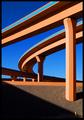
Interstate Abstract by Firstrich1Comment: Critique Club
Composition
The composition is impressive. You included the fire hydrant for perspective, you have diagonal lines disappearing into one of the corners of the image and you captured the architectureal beauty and magnificence of this subject against a graduated backdrop of ever darkening sky. Artistic of you to see something like this and then be able to capture it to share with others. Because this was based on the Advanced Editing rules, however, I would like to see just a couple of changes to your composition. The large vertical column just above the fire hydrant has what appears to be a white sign on it (in the shaded area). I think it would enhance the photo to clone that out. Likewise under one of the spans of highway that runs almost horizontal you should be able to see what appears to be a traffic sign. I think the picture would benefit from having that cloned out as well. Those two things are minor nits and easily overlooked on first viewing of the photo though.
Color
The colors in this shot were kept to a minimum (probably by the designers of the interstate) but it works well for you because it allows the grace of the design to speak more powerfully. The organic orange hue seems to work well whether it is cast in full shade, sidelit or in direct sunlight. The yellow/orange of the hydrant is starkly lit against the shaded cement. The range of blue in the sky is a beautiful backdrop against which the scene can be set. The high-octane blue along the side of the interstate walls works in contrast to the muted orange and the darker blue in the upper left corner. The image contains few colors but they all receive ample space in the photo so that they help to create a beautiful scene. Rather than having blobs of color, the extended lines help reinforce the graceful concepts that went into this design.
Focus
You have ample depth of field here with your aperture of 9.0. I'm sure the amount of ambient light you had to work with helped you and I think that any smaller aperture would not have worked (see Lighting).
Lighting
My argument against a smaller aperture is that I think it may have resulted in shadows that were too dark to create the 3-tone effect that some of the roadway has; I think it would have tended to generate areas that were "in light" versus areas that were "shaded". With your capture you have produced 3 distinct ranges out of one color. The whole interstate seems to thrive off the bright orange hue on its surface but you have enhanced that by going when this section was in direct sunlight and you have further deepened the color by shooting at f/9 which allowed you to get brightly lit sections of the road as well as mildly lit ares and much deeper shadows. The shadow running down to the fire hydrant is also timed almost perfectly; it leads the eye down the photo to the hydrant.
Overall
This photo is a very strong shot given your title. You truly nailed what it looks like you were aiming for. It is abstract art from a view of an interstate roadway. Congrats to you for seeing it and noticing the beauty and balance inherent in this view and even more for being able to capture it and share with us. It is deserving of an award. This capture the essence of the design that others labored to produce; to me you got exactly what a photographer should look for: a replica that inspires its viewers in a similar manner to how the original view must have inspired you. |
| Photographer found comment helpful. |
| 03/18/2004 05:45:07 AM |
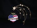
Freedomby candycornComment: I understand artistic interpretation and like to "vote up" stuff that might seem to not fit the challenge but where are the parallel lines in this composition? The lines on the flag? If so then they are a very small piece of this and the submission suffers for it. I like the use of negative space but if the flag lines are supposed to be your parallels then they don't seem to create the strength of the whole photo, they seem an afterthought. It is a fairly good photo although I'd move the subject out from the background as a shadow is visible behind and below the stars as well as the eagle. Perhaps trying this without the starfall item attached to the heart-shaped piece would render a strong result. |
| Photographer found comment helpful. |
| 03/18/2004 05:39:30 AM |
Life of grimeby johnmComment: Dang. Your lens filter needs to be replaced. Just kidding. Looks like you shot through something like a window. That's pretty distracting. You chose what could probably be a decent sbject but between the glare from the sun, the trucks at the bottom of the photo and the overall marred image (due to whatever you shot through) the image suffers. I'd suggest an uninterrupted line of sight to the subject as well as a much tighter crop to make them the central figures in the image. |
| Photographer found comment helpful. |
| 03/17/2004 07:24:17 AM |
color pencilsby alysaComment: Very good idea. I can overlook a little distortion due to the wide angle of the photo but it becomes distracting to me when I can't seem to find the focus point. The fact that I cannot easily select anything in particular to focus on detracts a little from this composition. Also the bright yellow pencil on the right creates a boundary that should be mimiced on the left of the photo. The intensity of that color seems to draw attention to the lack of balance. Very good idea and a decent attempt. I think if you worked with this more by perhaps put down black construction paper and laid clear plexi over it to remove the wood grain while keeping the reflection, then worked on a little more symmetry and getting a slightly more pronounced focus point/subject this would be a killer shot. As it is I see it as a 5. |
| Photographer found comment helpful. |
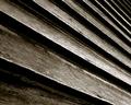
| 03/17/2004 07:18:43 AM |
Rustic Linesby cbellerComment: You've captured wonderful texture in this shot. The lighitng gets just a little hot towards the bottom right but this is a wonderful capture. Your choice of duotone was right for me. The increasing number of slats in the upper right are a slight annoyance but I don't think a tighter crop would have been as meaningful or presented as moody a shot to me. |
| Photographer found comment helpful. |
| 03/17/2004 07:16:12 AM |
The answer, my friend, is...by budokanComment: I like the odd angles of the arms but some kind of consistency with the clothes pins just to help highlight the parallel lines (or you could have removed all the pins) would have enhanced the photo. The scarf/hanky blowing in the wind (great title, btw) also doesn't add anything to the photo from a technical standpoint but it does give the titular tie in and so has some artistic value. Great choice of a different perspective. |
| Photographer found comment helpful. |
| 03/15/2004 08:21:23 PM |
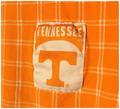
Taylor Marieby PaigeComment: This is not only a cute capture it is a fairly well done portrait. In color it might actually be better as my main nits are related to skin tone and texture. While this capture skirts around with having blown out sections it maintains good solid representation of the depth and texture of the hair, eyes and shirt. The skin on the face lacks some definition, however, between the brows and the hairline, on the subject's right cheek and the chin. The subject's arm also loses some definition around the wrist. One thing that might actually help this while still maintaining the monochromatic look is to go into Channels in Photoshop (or similar program); select only the Green channel and choose the whole photo (click on the green channel and then choose Select | All); now select all the channels by clicking the RGB selection and then go back to the Layers tab. Create a new layer; select the newly created layer and chose Edit | Paste (or CTRL-V) to paste the Green channel over the top of the RGB version. Now you can change the Blend mode and the Opacity to bring out some definition in the skintones while keeping the monochromatic look to the image (you'll probably find that somewhere around 10% opacity inserts enough definition without giving too much of a hue to the image). This edit is allowed with the Advanced editing rules in place. Good subject and good capture. |
| Photographer found comment helpful. |
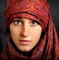
| 03/15/2004 08:09:54 PM |
portre ressamiby kiwinessComment: Great capture. One of the best from the challenge. I like the composition and see very little technically that I would consider doing anything to change but the subject's left cheek (photo right) is slightly overexposed; not blown out. It might be worth it to select the area from under the eye across to the nose, down to the top of the lip and back up at a diagonal towards the outside edge of the eye and then apply a slightly darkening curve adjustment layer just to try and even out the skin tone. I don't like the crop with so much cloth at the top as the cloth almost becomes a competitor with the subject's face and eyes for being the more prominent in the photo. Having said that, I like the shot and score it well above average. Good job just as it is. |
| Photographer found comment helpful. |
Home -
Challenges -
Community -
League -
Photos -
Cameras -
Lenses -
Learn -
Help -
Terms of Use -
Privacy -
Top ^
DPChallenge, and website content and design, Copyright © 2001-2025 Challenging Technologies, LLC.
All digital photo copyrights belong to the photographers and may not be used without permission.
Current Server Time: 04/19/2025 07:06:27 AM EDT.