| Image |
Comment |
| 07/29/2006 02:55:53 PM |
|
 Photographer found comment helpful. Photographer found comment helpful. |
| 07/26/2006 09:41:31 AM |
|
| Photographer found comment helpful. |
| 07/25/2006 03:12:24 AM |
Towards the Waning Lightby ArtysteComment: Wow. Yet another photo that proves that not all sunsets are created equal . . . well, OK, perhaps this is just evidence that not everyone sees the same thing in a sunset. You've imparted action and interest to this image by turning the camera some and also hiding the element that most people expect to see in a sunset, namely, the sun. This photo implies the sun and takes advantage of the golden hues to create a lovely tone across the whole image so that I believe the viewer is invited to remember not a specific locale but memories of his/her sunsets at the end of the day out around the water. Love the camera tilt on this image, too. Looks like a little bit of banding around some parts of the sunset. |
| Photographer found comment helpful. |
| 07/25/2006 03:08:48 AM |
The scriptby pineappleComment: Creative, not too heavy-handed in its use of "gold". Good use of composition with leading lines and contrasting lines under the subject that don't overpower the subject (the gray/silver ink blends into the background too much to compete). One of my highest images. I love the subtleties I perceive in this shot. |
| Photographer found comment helpful. |
| 07/25/2006 03:06:01 AM |
Flying over Golden Pondby LimboComment: For me the ducks/geese and the cloud formation directly over the sun compete with the gold coloring. They don't necessarily overpower it but they do detract from its importance in the image for me. |
| Photographer found comment helpful. |
| 07/25/2006 03:04:56 AM |
Golden Sandsby GIS_boyComment: Colors are a tad too much for my taste but I appreciate the work on this and the vision that led to this. |
| Photographer found comment helpful. |
| 07/25/2006 03:04:12 AM |
Moroniby coolharComment: This image of a plain sculpture stands out to me because of the angle from which you chose to see it. You created some interest through your composition. |
| Photographer found comment helpful. |
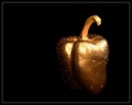
| 07/25/2006 03:03:00 AM |
Gildedby SJCarterComment: nice to see someone approach this from a simple point of view. Clean image, my eyes were drawn to the subject. Perhaps just a touch too much water for my taste but that doesn't affect anything. Nice lighting to keep the interest on the subject. This is one of the stronger images for me. |
| Photographer found comment helpful. |
| 07/25/2006 02:57:42 AM |
Midas' Touchby 3eyedcrowComment: Good idea but I'm not sold on the execution. The rose could have been a more robust goldtone instead of being so washed out for my taste. The gold point of light is surely your intended focal point but my eyes immediately traveled left to the rose as I started to assimilate the story behind the image and the hook you had used with the light just slipped away without the strong flower color to set it. Good try, tho. |
| Photographer found comment helpful. |
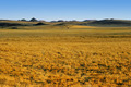
| 07/25/2006 02:55:02 AM |
Field of Goldby angela_packardComment: Nice use of thirds. This image outperforms other landscapes/sunsets in this challenge for me in that gold is the dominant color, none of the colors appear to have much banding, you've captured some lovely contrasting textures between the foreground & background and I love the tonal shift as my eyes move up the photo. |
| Photographer found comment helpful. |
Home -
Challenges -
Community -
League -
Photos -
Cameras -
Lenses -
Learn -
Help -
Terms of Use -
Privacy -
Top ^
DPChallenge, and website content and design, Copyright © 2001-2025 Challenging Technologies, LLC.
All digital photo copyrights belong to the photographers and may not be used without permission.
Current Server Time: 04/02/2025 06:08:25 PM EDT.