| Image |
Comment |
| 07/09/2008 06:03:55 PM |
|
| 11/15/2007 11:34:29 AM |
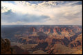
Big Bowlby HoserComment by The_Dentist: Hmmmm - excellent! Magnificent sky - that really makes the photo! Very often people forget when shooting landscapes that one of the crucial elements is... the sky.
I agree with previous comment that horizon should not be in the middle - I've made that mistake myself many times. Now the problem is - where do you move it, up or down? You don't want to cut out the canyon, but you don't want to crop that great sky either! Tough choice, I guess maybe on the spot, through the lens, it's easier to make this decision.
Yes, colors are muted and hazy, but I don't think there is anything you could have done differently photographically - this is properly exposed. Any more and you would have blown out the sky. So either shoot at a different time of day (not easy, it's not like this view is from your backyard, I know) or maybe a GND filter?
Now, this problem can be somewhat solved in Photoshop. I will give it a quick go later and see if the beautiful tones and textures in the rock can be brought back to life.
Great shot.
Matei
Edit: oh, and the close-up rock in the bottom left contributes more to the balance and "impact" of the image than it would seem at first glance. Message edited by author 2007-11-15 11:35:19. |
 Photographer found comment helpful. Photographer found comment helpful. |
| 11/15/2007 10:20:09 AM |
Preludeby HoserComment by LoudDog: I like the image, great colors, great location and great time to be there. Only complaint is the same as the other photo, try not to center the horizon. If you crop off the bottom or top 1/3 of the photo I like it better. |
| Photographer found comment helpful. |
| 11/15/2007 09:55:08 AM |
Big Bowlby HoserComment by LoudDog: I like the photo, but the color of the canyon seems muted. It makes it less grand then it really is. Also, just a rule I go by, but I try to not put the horizon in the middle of the shot. I like to split the photo into thirds. |
| Photographer found comment helpful. |
| 11/15/2007 08:38:06 AM |
Big Bowlby HoserComment by NikonJeb: A difficult task to photograph the Grand Canyon. It's just too hard to capture the sheer grandeur. The haze works against this particular shot. |
| Photographer found comment helpful. |
| 11/15/2007 07:42:09 AM |
Preludeby HoserComment by NikonJeb: I have an untrained, unrestricted view and I like it right the way it is. To me, this is kind of a whole deal kind of image......I'm not drawn to any one part and that's okay because the image has many nice things about it that allow me to just stare at it and enjoy it in parts.
But hey, I'm just a hack who likes pretty pictures!!! And that it truly is!!! LOL!!! |
| Photographer found comment helpful. |
| 11/15/2007 03:31:28 AM |
Preludeby HoserComment by FrankRobinson: I have to agree with the other comments. By centering the horizon, you have divided the photo equally so the eye does not know which way to go. Additionally the black foreground cuts the bottom portion in half, which acts as something of a barrier (perhaps would not be the case if it was not completely in shadow?). I would crop out the bottom section to leave the horizon 1/3 up the photo, with a small black foreground at the bottom. Perhaps it could be crisper? Difficult photo to take though. |
| Photographer found comment helpful. |
| 11/15/2007 02:47:10 AM |
Big Bowlby HoserComment by cpanaioti: The lighting on the cliffs is sweet. The clouds may be a bit blown out though. |
| Photographer found comment helpful. |
| 11/15/2007 02:18:29 AM |
Preludeby HoserComment by fotomann_forever: I like the shot. I think the composition could have benn made a bit stronger by not centering the sun in the image from left to right though. |
| Photographer found comment helpful. |
| 11/15/2007 02:02:42 AM |
Preludeby HoserComment by Shadowi6: Nice Shot, The Border works well for me, perhaps their is too much foreground, so a crop into the black piece and over to the right might work well. Yep the more I look at it the better I think it would work with out the bottom bit, it stops the eye from going further through he photo. Nice job thou |
| Photographer found comment helpful. |
Home -
Challenges -
Community -
League -
Photos -
Cameras -
Lenses -
Learn -
Help -
Terms of Use -
Privacy -
Top ^
DPChallenge, and website content and design, Copyright © 2001-2025 Challenging Technologies, LLC.
All digital photo copyrights belong to the photographers and may not be used without permission.
Current Server Time: 03/11/2025 02:09:10 PM EDT.