Obsessionby
jotagaComment by Ecce_Signum: Greetings from Andi via the Critique Club
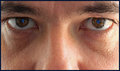
First Impression: ok, it wasn't going to ribbon but even before I read it was a sp I felt it deserved better than 5.1. And no, its not as easy as peeps might have thought.
Composition:I like the crop you used, just showing what you needed to in order to convey your message.
Subject: Well done on the creation and execution, its something I've wanted to try for a while but lost patience trying a sp so thanks! The stare and ribbons do 'reflect' obsession so everything ties in nicely.
Technical: Me? I'm happy the bridge of the nose is oof, no need for it to be in focus to me (though been dinged for submitting purposefully oof eyes more than once). The eyebrows could have been a little sharper to frame the eyes but think what really lowered your vote were the blown areas.
Final thoughts: IMHO this should be in B&W, slightly underexposed with some burning of the blown areas and a little dodging to bring back some detail then finaly erasing the B&W from the eyes to let the brown & blue pop. Hope this helps? let me know if uou'd like to discuss further?