| Image |
Comment |
| 11/18/2003 04:54:39 AM |
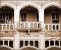
Romeo & Julietby jackditchComment by e301: Arguably not a book, but I'm not splitting hairs. I think the perspective distortion really hurts this image. Also perhaps you haven't got far enough away, or you've cropped too close - including what I presume are more pillars either sie of these archways would emphasise the repetition more fully. As it is ... well, solid photography, but there's no drama, no mystery - if you could have shot it at night, with light streaming out of just one window ... |
 Photographer found comment helpful. Photographer found comment helpful. |
| 11/17/2003 12:06:17 AM |
|
| 11/16/2003 10:51:20 PM |
|
| 11/14/2003 10:13:26 PM |
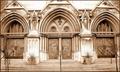
choose your faithby jackditchComment by dsidwell: Magnificent tones here evoke a sacred, clean feeling in me. I kind of wish the points above the arches were still there, but the clariy and communication here is so, so nice! |
| Photographer found comment helpful. |
| 11/14/2003 09:23:42 PM |
|
| 11/14/2003 08:16:26 PM |
|
| 11/13/2003 09:38:57 PM |
choose your faithby jackditchComment by kosmikkreeper: The choice of sepia is pleasing to the eye and the levels are spot on! You chose a ncie subject even though churches have been overly used in this challenge. Only thing I would change would be to seethe tops of the pointy things there. :-) |
| Photographer found comment helpful. |
| 11/13/2003 09:11:37 PM |
Romeo & Julietby jackditchComment by waterlilies: The picture itself is nice, though it's a bit asymmetrical. A bit cropped off the right would help that part, if you're interested in symmetry. But the title isn't directly reflected in the photo. Romeo and Juliet did have a lovely balcony scene, but without having read the play or seen the movie, a person couldn't know that. |
| Photographer found comment helpful. |
| 11/13/2003 09:35:32 AM |
|
| Photographer found comment helpful. |
| 11/13/2003 12:17:24 AM |
Romeo & Julietby jackditchComment by mariomel: I like this image. I find the textures and colours and shadings very well done. The only thing that might have made it better is to crop more for the whole symetry aspect. A little more cropping on the right side to even things out. Still, excellent image. 7 |
| Photographer found comment helpful. |
Home -
Challenges -
Community -
League -
Photos -
Cameras -
Lenses -
Learn -
Help -
Terms of Use -
Privacy -
Top ^
DPChallenge, and website content and design, Copyright © 2001-2025 Challenging Technologies, LLC.
All digital photo copyrights belong to the photographers and may not be used without permission.
Current Server Time: 03/12/2025 09:19:18 PM EDT.