| Image |
Comment |
| 01/09/2010 07:26:22 AM |
|
 Photographer found comment helpful. Photographer found comment helpful. |
| 01/09/2010 01:18:29 AM |
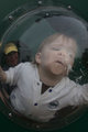
Self-Portraitby caseyfaceComment by SandyP: I personally love the color. For me it does amazing things for the old grungy look of the building you are in, and red building outside gives it a wonderful richness. I wonder how it would look if there was a much tighter crop around you. You are so pretty and have kind of a dramatic look, so I wonder if featuring that more would make this even more awesome ? But I really do like it like this too.
|
| Photographer found comment helpful. |
| 01/08/2010 07:07:59 PM |
Self-Portraitby caseyfaceComment by ErikV: To answer your questions:
a) I think the color version works fine. B&W may also be good -- give it a try and place them side by side in a new post and we can let you know how it worked out
b) To rescue the roof, try the highlights portion of the shadows/highlights aduster, athough it is possible it is too bright to be saved. But the roof does not bother me that much since you got the correct brightness on your face.
Although the composition is a bit atypical, I like your pose a lot. And you did a good job with the exposure/lighting of your face. |
| Photographer found comment helpful. |
| 01/07/2010 09:42:33 PM |
|
| Photographer found comment helpful. |
| 01/07/2010 09:07:07 PM |
|
| Photographer found comment helpful. |
| 01/07/2010 11:55:54 AM |
|
| Photographer found comment helpful. |
| 01/06/2010 11:05:13 AM |
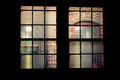
The View From Hereby caseyfaceComment by Paul: OK, I'm going through the Free Study submissions, purposefully finding those images I think are shot with a less conventional eye - this is one of those images! Thanks for offering something that isn't just DPC friendly eye-candy (though of course there's nothing wrong with eye-candy). I'll be picking one of these images for the Mu (most underrated) award:
Positives: Oh, I really like this - but what's really annoying me is that I don't know why! What sort of a critique is this going to be?? Let me try - I like how it is inside / out / outside / in; hidden and revealed; public and private; free and constrained. Does any of that make sense?
Critical stuff: Perhaps the crop? I keep wishing the window was central in the frame but I suspect if I played around with it, it would look better just as it is.
Overall: So much more than the sum of its parts - taken by someone who really 'sees'. |
| Photographer found comment helpful. |
| 01/05/2010 11:30:40 AM |
|
| Photographer found comment helpful. |
| 01/05/2010 11:29:59 AM |
|
| Photographer found comment helpful. |
| 01/05/2010 11:28:48 AM |
|
| Photographer found comment helpful. |
Home -
Challenges -
Community -
League -
Photos -
Cameras -
Lenses -
Learn -
Help -
Terms of Use -
Privacy -
Top ^
DPChallenge, and website content and design, Copyright © 2001-2025 Challenging Technologies, LLC.
All digital photo copyrights belong to the photographers and may not be used without permission.
Current Server Time: 04/25/2025 09:18:58 AM EDT.