| Image |
Comment |
| 08/22/2009 11:30:21 AM |
Mosquito Killerby micComment by vawendy: The background is very distracting in this image. especially the weather stripping on the door (since it doesn't lay flat). Interesting idea, but it think it would have done a lot better with a different background. |
 Photographer found comment helpful. Photographer found comment helpful. |
| 08/22/2009 10:51:38 AM |
|
| Photographer found comment helpful. |
| 08/21/2009 08:10:02 PM |
Mosquito Killerby micComment by bobnospum: Not a big fan. The dusty floor is kind of ugly and the white highlight on top is a distraction. |
| Photographer found comment helpful. |
| 08/21/2009 12:32:27 PM |
Mosquito Killerby micComment by liberty: Nice focus, could have used more of a crop, to rid the image of the top white light, and brought the focus directly to the machine, 6. |
| Photographer found comment helpful. |
| 08/19/2009 06:24:48 AM |
Mosquito Killerby micComment by Lutchenko: nice idea but i'm not keen on the composition or the background
I think this would have worked really well with a black background and and off centre composition. |
| Photographer found comment helpful. |
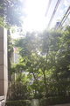
| 08/19/2009 04:38:05 AM |
Shinedownby micComment by johnnyphoto: You should try playing around with curves and levels in your editing program. I would level the picture because it seems tilted. Also, some contrast and a touch of saturation might help compensate for the washed out look.
I love pictures of light shining through trees. Very cool idea :) |
| Photographer found comment helpful. |
| 08/19/2009 01:26:52 AM |
Mosquito Killerby micComment by RobMcGee: interesting shape but too small and it appears flat from this view i'd prefere a more 3D aspect, more light, less reflections, 3 |
| Photographer found comment helpful. |
| 08/18/2009 11:44:40 PM |
Shinedownby micComment by bcenu: The overblown sunlight spoils the shot even though you were trying to get the band name across. |
| Photographer found comment helpful. |
| 08/17/2009 06:33:48 PM |
|
| Photographer found comment helpful. |
| 08/17/2009 03:56:33 AM |
Shinedownby micComment by Blackbox: Normally I would say this is totally overexposed. For this challenge...I think this is great! Awesome work...10 |
| Photographer found comment helpful. |
Home -
Challenges -
Community -
League -
Photos -
Cameras -
Lenses -
Learn -
Help -
Terms of Use -
Privacy -
Top ^
DPChallenge, and website content and design, Copyright © 2001-2025 Challenging Technologies, LLC.
All digital photo copyrights belong to the photographers and may not be used without permission.
Current Server Time: 03/12/2025 10:32:40 AM EDT.