Simpleby
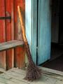
indigo997Comment by zeuszen: What a wonderful straightforward photo of simple things! Colours and tones, alone, would have made for a satisfying study. The three planes of washed reds, blues and black make for a natural compositional element, well taken advantage of.
I do question the need to include as much of the red wall, bench and rail (on the left) as has been done here. A somewhat tighter crop here (or a slight shift of the whole image to the left), IMO, would have excluded any reduncy while aligning the groove between threshhold and steps with the corner at bottom right.
The image appears to have been aligned along the crack between door frame (blue) and siding (red). Yet the dark vertical space between frame and door is a little top-heavy (right tilt), probably due to both the aging structure (of the house) and/or barrel distortion. If the discrepancy between the two measures were balanced out, I believe, the overall perception would be one of proper and natural alignment. ??
Despite these minor considerations, a quietly unassuming photo of considerably beauty.