| Image |
Comment |
| 10/14/2003 01:44:57 PM |
|
| 10/12/2003 08:22:55 PM |
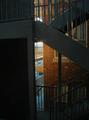
Urban Causewaysby SportyGirlComment by visitor: Nicely seen but the large block of shadow on the left draws the eye too much.
Perhaps could benefit from cropping that side to the vertical support. |
| 10/10/2003 05:54:08 PM |
|
| 10/10/2003 11:50:53 AM |
Urban Causewaysby SportyGirlComment by pcody: I like the play between light and dark. There are enough details to make this interesting, and the flatness makes it look like a cartoon world. Good job. Too much blankness on the left, but that's minor. |
| 10/09/2003 10:05:47 AM |
Urban Causewaysby SportyGirlComment by Neuferland: This shot fits the challenge very well, really conveys that sense urban to me very well. The only thing that would have made this shot better for me would be the lighting, the left side is too dark for my taste but otherwise, good job! |
| 10/08/2003 03:29:24 PM |
Urban Causewaysby SportyGirlComment by elemess: I wish I could see more of the brick detail on the left. I like the play of light on the building on the right; maybe that could have been more prominent in the photo. |
| 09/29/2003 01:42:41 AM |
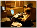
Sleepin On the Jobby SportyGirlComment by Fayech: i think this shot would be more effective is you could have zoomed in to get closer to the subject. either that, or have a larger image. (looks like he wasn't working anyway, but watching tv!) |
| 09/27/2003 12:35:26 AM |
|
| 09/26/2003 01:18:15 PM |
|
| 09/25/2003 04:23:54 PM |
|
Home -
Challenges -
Community -
League -
Photos -
Cameras -
Lenses -
Learn -
Help -
Terms of Use -
Privacy -
Top ^
DPChallenge, and website content and design, Copyright © 2001-2025 Challenging Technologies, LLC.
All digital photo copyrights belong to the photographers and may not be used without permission.
Current Server Time: 04/27/2025 12:16:10 PM EDT.