Stackedby
enmckComment by hojop25: Greeting from the Critique Club!
First of all my impressions.
Well done on your first entrie, a score of 5 isnt bad for a first score.
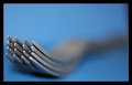
Nice close up, but the d.o.f is a little too shallow.
for an on camera flash it isnt bad lighting, not to harsh, but it could be a bit better without the shadows.
Silver wear always works well with bright and cool colours, such as blue, so good choice there.
Technical factors:
The composition of the image could be better, the eye draws you to the out of focus area of the image, because of the shape.
Also if you cropped the slightly dark part at the right, it would draw less attention to that area.
Focus, it could be more crisp, im guessing you where going for a really shallow dof look?
Although it would be much better if atleast all four prongs where in focus
The tones/white balance are perfect, not too blue, or yellow.
Also the border is too thick and ugly, which may not seem to have an affect but it does unfortunately, if you are going to have a border with bright colours white is usually better, but if you stick with black make it thinner than this, and as this is your first image, im not sure if you are thinking of going to give all your photos a border, only give an image a border if it isnt "framed" in the picture itself, and if the subject is sort of going of/near the edge of the photo like the forks.
Overall:
Its a well executed photo, decent lighting, nice d.o.f in my opinion, and good idea putting it on blue. i think the reason you didnt do better is becuase of the border, d.o.f (in others opinions) and because the subject and idea isnt too interesting.
Hope this helps, for future images, good luck!