| Image |
Comment |
| 04/19/2005 09:24:18 PM |
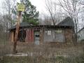
Keep Out Collapse Inby SchmalComment by Tuckersmom: Great building, maybe if you had moved closer (even though it does say "keep out":) you could have eliminated the branches in the front to give a clearer view and also get rid of the house on the right |
| 04/19/2005 10:23:11 AM |
|
| 04/18/2005 08:52:35 PM |
Keep Out Collapse Inby SchmalComment by mischff: I really like this shot. If I could change anything... I would love to be able to read those signs... just human nature! |
| 04/18/2005 03:42:01 PM |
Keep Out Collapse Inby SchmalComment by docurrie: I think I would have tried to get an angle of this building where the sign on the post wasn't included. I doesn't add anything and distracts from the building. |
| 04/15/2005 08:42:20 AM |
|
| 04/13/2005 08:41:53 PM |
|
| 10/18/2003 11:43:11 AM |
|
| 10/17/2003 06:46:07 PM |
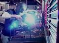
Weldingby SchmalComment by ScantyNebula: I think the colors need to be adjusted, there is too much of a green tone here. Could be more crisp. 7 |
| 10/17/2003 04:15:16 PM |
Weldingby SchmalComment by WhidbeyPix: pretty cool. I would have made a couple of changes: adjust the RGB levels a little bit... a little less green/blue and more red/yellow or just less green, and then the blue would be stronger. Also the glare is a bit strong. |
| 10/16/2003 11:49:45 AM |
Weldingby SchmalComment by bruski: I like the image. Could almost be an add for Ford. The one thing I think I would change, however, Is I would crop in tighter from the right and eliminate the shelves. They draw a little too much attention from the main subject. I like the high contrast look that is achieved by the bright light as well. |
Home -
Challenges -
Community -
League -
Photos -
Cameras -
Lenses -
Learn -
Help -
Terms of Use -
Privacy -
Top ^
DPChallenge, and website content and design, Copyright © 2001-2025 Challenging Technologies, LLC.
All digital photo copyrights belong to the photographers and may not be used without permission.
Current Server Time: 03/12/2025 09:17:43 PM EDT.