| Image |
Comment |
| 06/22/2016 12:39:27 PM |
|
 Photographer found comment helpful. Photographer found comment helpful. |
| 06/21/2016 07:15:34 PM |
POLICEby RyanWComment by tnun: you made me laugh. and think of donuts. am I bad? |
| Photographer found comment helpful. |
| 06/17/2016 01:36:17 PM |
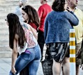
Cacophanyby RyanWComment by sidpixel: Hello from the critique club
A mediocre image that meets the challenge at a basic level
This is really quite a confusing image that does not have a strong focal point. The main characters are the two women in the foreground who both have their backs towards us, neither of whom have been caught at a very flattering moment for them especially the lady on the right. The only person whose face we do get to see in full profile is the lady in red who is actively distracted, probably, by her mobile device, she is not engaged with her surroundings. The most dominant element is the gent in the background in the strongly coloured red jumper, your eyes are constantly drawn to him but again he is not of this scene in any constructive way. In the meantime all of this has a dominant foreground white and gold post that does nothing positive to the overall construct.
I rather feel that you have taken too literally the �snapshot� part of the description as opposed to anything that Manet would have been likely to paint. I�m sorry Ryan but I can�t see anything in this he would have been inspired to commit to canvas. |
| Photographer found comment helpful. |
| 06/15/2016 04:27:12 PM |
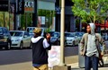
Cool guys, cool colorsby RyanWComment by sidpixel: Hello from the critique club
An unappealing image that does not meet the challenge
Well, here you have a street scene of an interrupted image in the taking but we don�t know what has caused the interruption which is often ok because it introduces intrigue but I�m just not feeling that sense of intrigue. The image feels too much like a snapshot, there just doesn�t seem to have been any real thought gone into it. I think the composition may be the reason why, I am just put off by the dominance of that street post that dissects the whole image in two and the sign by it. In what is a predominantly lower key background this high key post just takes over the whole image. As for the challenge itself there is no single strong focal point or key element that reflects the challenge brief effectively enough especially with that post.
Sorry Ryan but I�m afraid this didn�t work for me this time. |
| Photographer found comment helpful. |
| 06/15/2016 01:36:55 AM |
|
| Photographer found comment helpful. |
| 06/04/2016 09:48:06 AM |
|
| Photographer found comment helpful. |
| 06/02/2016 01:24:43 PM |
|
| Photographer found comment helpful. |
| 06/02/2016 01:04:13 PM |
|
| Photographer found comment helpful. |
| 06/01/2016 08:43:49 AM |
Glass at workby RyanWComment by JakeKurdsjuk: In my top 3 and I'm surprised to see it this far down. If I had a suggestion (I always do) it would be to either square up the right side (free transform, perspective adjustment or rotation) or skew it some more - it's just a little too close to square to make it feel like an intentional edit. |
| Photographer found comment helpful. |
| 05/31/2016 03:46:32 PM |
Glass at workby RyanWComment by Pangurban: Really like the composition but the colour is overall a bit 'grey' for my taste. Wonder what it might have looked like in B&W? |
| Photographer found comment helpful. |
Home -
Challenges -
Community -
League -
Photos -
Cameras -
Lenses -
Learn -
Help -
Terms of Use -
Privacy -
Top ^
DPChallenge, and website content and design, Copyright © 2001-2025 Challenging Technologies, LLC.
All digital photo copyrights belong to the photographers and may not be used without permission.
Current Server Time: 04/19/2025 03:52:35 AM EDT.